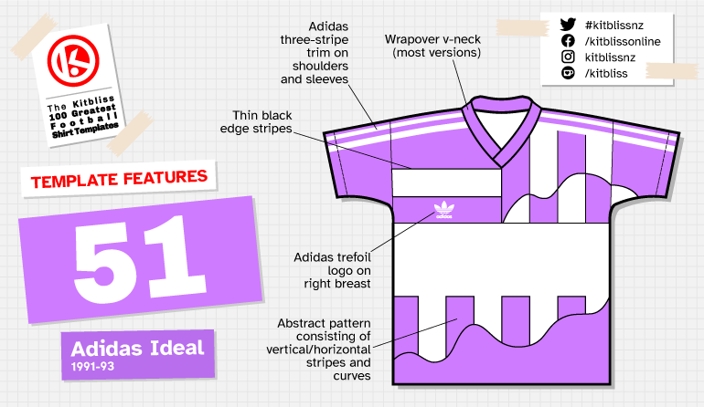
51. Adidas Ideal (1991-93)

Chris Oakley | 15 January 2024
At the start of the previous article, I noted how Adidas always seem to insist on simplicity whenever they roll out a bold new template design. I may now need to revise that statement.
At the start of the 1990s, football kits (and shirts specifically) were starting to look more imaginative. Plain shirts were a thing of the past, pinstripes were history (for the time being), and shadow patterns were adding greater detail than ever before. But where to next for designers keen to establish the new ideas and trends that would captivate fans everywhere?
One suggestion came in the form of an Adidas template that didn’t so much rip up the rule book as put it through a shredder, douse the remains in petrol and set fire to them. Would it become a future classic? Of course not. It was far too bizarre for that, but it would stand out from the rest sufficiently well as to be distinctive more than 30 years hence.
I’ve been unable to find the official name for this design *, so I’ve given it the unofficial title of ‘Nexus.’ There are so many junctions and connections all over the shirt that it looks like Piet Mondrian took LSD and attempted to draw a map of Manhattan, taking an occasional sip of absinthe as he did so.

From left: Argentinos Juniors (1993 home), Bayer Leverkusen (1991 home), Etar Veliko Tarnovo (1991-92 home), Legia Warsaw (1992-93 away).
It’s a remarkable piece of work when you realise what’s going on here. This is a shirt design that doesn’t feature full repeating vertical or horizontal stripes, yet manages to imply that both are there, while at the same time integrating curved elements that break up and distort the strong 90-degree angles. As if that wasn’t peculiar enough, there’s a broad horizontal band which, one must assume, is provided as a space to show off a main sponsor logo. Not much use if you’re a national team wearing this, so you can add ‘redundant aesthetic’ to the list of strangeness, too.
Yet for all that, the design works really well. People better qualified than me would say the multitude of stripes, lines and curves provides a sense of movement that captivates the eye, and it certainly does. People less qualified than me would say it’s a dog’s breakfast that’s an affront to the sensibilities of the modern football fan. I say ‘nonsense.’ Though never adopted by any great number of teams at the time, it’s exactly suited to the era from which it emerged; a design that needed to happen, if only to remind future kit designers how boring their conventional ideas were by comparison.
Of the paltry smattering of shirts that were based on Nexus, the one that crops up most often on the web is that belonging to Hanover 96. To the best of my knowledge (and time-consuming research) however, it was never actually worn in a first-class match. Even in pre-season team photos taken around the time, the only people that seem to be wearing it are the training staff. That said, I await correspondence from someone somewhere in the world who can conclusively prove otherwise, especially as Schalke’s blue/white version and Bayer Leverkusen’s red/white equivalent only came to light late on in the piece. In both cases, their Nexus shirts only seem to have been worn for part of a season, lest the clubs in question be deluged by an avalanche of complaints by the fans.

From left: Luxembourg (1992 home), Luzern (1992 home), Schalke 04 (1991-92 home).
Germany seems to have been the epicentre of Nexus popularity with three top clubs daring to wear this most way-out of Adidas creations, but across the border, Luzern mimicked Schalke’s blue in Switzerland, while further afield it appeared for Etar Veliko Tarnovo in Bulgaria and Legia Warsaw in Poland. Legia’s version tends to be listed online as an away shirt, but given the heavy presence of green, it was really only ever an alternate home shirt in reality.
A spell of worthy exposure in South America came courtesy of Argentinos Juniors, but by the close of 1993, its light had been extinguished not just in Argentina but everywhere. Sadly, we weren’t to see more of Luxembourg’s red and grey ensemble, nor any of its colourful brethren. Thankfully, even today, there are collectors who seek out these shirts and marvel at the shear goofy magnificence of them. So they should. Template design like this doesn’t come around very often, and we’d do well to appreciate its originality whenever possible.
Many thanks go to Adam’s Shirt Quest and Jesper Krogshede Sørensen for their help in researching this template.
To see the full set of Adidas Nexus kits, visit the Adidas 'Nexus' template gallery page.
* Update:
Not long after my original post, I was delighted to receive a message from Lucas Silveira Santos on the Kitbliss Facebook page. He told me that one source on Instagram, not to mention some catalogues, refer to this template as Adidas Ideal. This was wonderful news, as I'm always keen to get the proper names for each of these templates.
Further investigation also tells me that two other German teams, Darmstadt and Lokomotiv Leipzig, may also have worn this design, so I'll try and confirm that before illustrating them and adding them to this page.
Meantime, I'd just like to say a big 'thank you' to Lucas for sending me that very valuable information, and don't forget, if you've seen any templates in this series and know of their official names (where not stated), please do get in touch...
