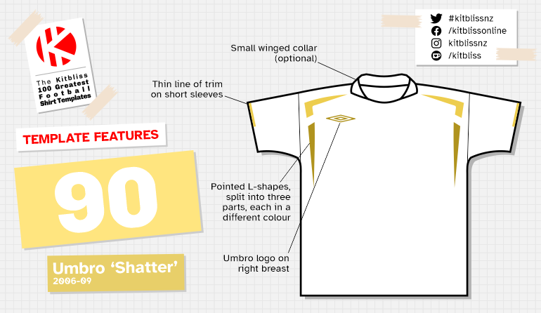
90. Umbro 'Shatter' (2006-09)

Chris Oakley | 5 April 2022
In the mid-2000's, Umbro were creating not just another set of football kit designs, but a whole new look. Best described as 'pointy', their shirt templates featured angular lines and tapered shapes that provided the antidote to the curves and curls Adidas were so fond of at the time. Displayed mostly across the shoulders and upper part of the shirt, Umbro's spikey shapes were quirky, interesting and designed to warrant closer inspection on the part of football fans. That they did, and in 2006 the overall look was restrained and simplistic. Within a year or so things got a bit messy - and not just in a design sense. More of that later...

From left: CSKA Moscow (2006 home, away and third).
Following the launch of Umbro's four-pointed star template in 2005, several successors were added over the next couple of years that had a shared design DNA. One of them was this one, for which the most striking element was a sharpened, inverted L-shape on both shoulders.
Divided into three sections, these punky boomerangs (well, what else would you call them?) provided a splash of contrasting colour to the upper corners of the shirt. On CSKA Moscow's kits from the 2006 season, this motif was also repeated on the sides of the shorts. A fetching reinforcement of that device, but not one that was worn by any other team, sadly.
Though those pointy 'L's were the stand-out feature on this template, other less showy details could be relied upon to strengthen the overall styling of the shirt. Often, a small winged collar provided a traditional touch, but where there was no collar, a couple of small flashes added colour around the neckline.

From left: Dundalk (2007 home and away), Hapoel Tel Aviv (2007-08 home and away).
Most (if not all) iterations of the shirt had side panels that were generally coloured the same as the rest of the shirt. Once again, however, those pesky Moscovians wanted to be different and opted for a contrasting colour on those panels where the home and away versions were concerned. They also made use of a long-sleeved version of the shirt that featured coloured pointy triangles near the elbows.
Taking customisation further still, Italian club Pescara added a panel along the top of the shoulders that showed off two pairs of solid Umbro diamonds. This helped to usher in the next phase of Umbro's design strategy where those diamonds would appear on other shirt templates. Whether those diamonds were superfluous on this template is a matter of opinion, but I think they worked well and didn't look particularly out of place. Furthermore, using those 'L' shapes on a striped shirt only proved the versatility of the design even more.

From left: Norway (2006-07 away), Pescara (2008-09 home), Shamrock Rovers (2007 away), Universitario (2006 home).
Umbro clearly thought this template had something going for it as they produced another version with unbroken spikes on the shoulders, but the extra colour variety makes this one my favourite. It also appeared on the football scene at a time when Umbro were acquired by Nike and helped maintain a sense of equilibrium when the change of ownership must have been unsettling for all concerned.
Thankfully, this template (and all its diamond-studded relatives) were allowed to have their time in the spotlight before Umbro were sold to Iconix Brand Group in 2012. Even more upheaval occurred at that point, but thankfully the British brand came back even stronger thereafter to make the fabulous kit designs we enjoy today. All the more reason to be grateful for his lovely Umbro template.
