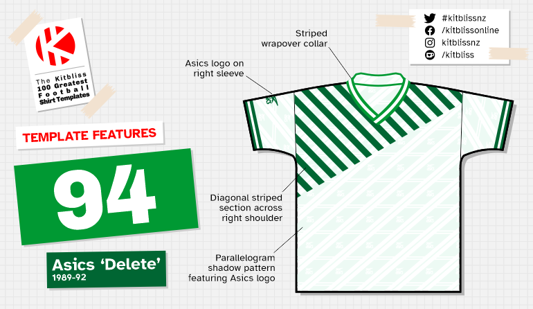
94. Asics 'Delete' (1989-92)
Chris Oakley | 8 March 2022
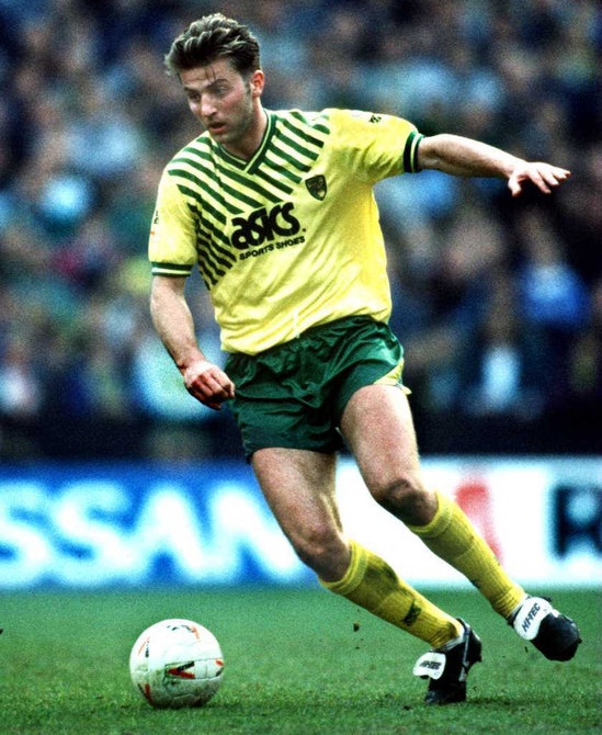
Of all the home shirts worn by First Division teams in the 1989-90 Football League season, Norwich City's was the most eye-catching. While many teams were conveying a sense of style through their shadow patterns, the Norfolk club took a more direct route thanks to their new kit supplier, Asics.
This was to be the first season in English football for Asics. They replaced Scoreline at Carrow Road and Hummel at Highfield Road, and in announcing their arrival they tried out one particular shirt template for both Norwich City and Coventry City. It consisted of a daring set of thin stripes encroaching diagonally over the right shoulder, a wrapover collar and, yes, a shadow pattern. You'd be forgiven for not realising it was there, however.
That striped section, cut off at an angle across the upper part of the shirt, was clearly the big selling point of the design. With the possible exception of Derby County in their centenary year, no-one had really created a shirt before where a core element was placed on the diagonal. This one did it in a clever way that didn't mask the background colour too much, but there were occasional issues. The striped area could slightly intrude on the sponsor logo which, in Norwich's case, was sometimes overcome with the use of a rectangular panel to block out the stripes. Awkward, but nothing serious in the grand scheme of things.

From left: Norwich City (1989-92 home), Norwich City (1989-92 away), Coventry City (1989-91 away).
Having wedged their foot in the door of English football, Asics doubled down by becoming Norwich City's main shirt sponsor too. Whether this is the reason for placing the smaller of their two logos on the right sleeve rather than the right breast, we'll probably never know. Two Asics logos on the trunk of the shirt could've triggered a minor panic at Football League head office, but in all probability it was more likely that the line-shaded area had caused another coherence problem.
Despite being newcomers to the kit suppliers' party, Asics were respectful of tradition and gave Norwich a white version of the same template to be worn where a colour clash ensued. In retrospect, it was a pity they didn't make the away kit all white to maximise the barely negligible change in colour tone. Instead, green shorts were retained, albeit a different pair featuring a diagonal stripe in white rather than yellow.

Asics shadow pattern, 1989-92.
Away from Norwich, Asics had a separate project to undertake at Coventry City. Their first home shirt for the Sky Blues reinstated the striped design worn during their victorious FA Cup Final win of 1987. Having ticked that box, they opted for our featured template as the basis of the away shirt. This time, instead of Norwich's yellow and green, they preferred yellow and black for a starker, bolder look. Coupled with black shorts adorned with a diagonal stripe on both legs, a fine contrast with the home kit was established.
In the years soon to follow, other manufacturers would also see the virtue of adding a diagonal detail to their shirts as if to acknowledge something missing from previous designs. Bukta gave West Ham shoulder flashes, Adidas rolled out a complete marketing juggernaut with their Equipment designs, while Hummel... well, perhaps they went a bit too far with the whole idea. Even so, they all took their inspiration from a Japanese sports shoe company that were willing to show they had something different to offer. The next chapter in the Asics story showed they were good enough to provide classy kit for the likes of Newcastle United, Aston Villa, Blackburn Rovers, Leeds United and many others, but that's to be told another day. For now, enjoy this splendid example of a great design, well executed.
Update:

A recent communiqué from Lucas has pointed out that Greece wore the Asics 'Delete' template but remarkably with the diagonal stripes on the opposite shoulder!
Evidence of the shirt (and indeed full kit) being worn can be seen in this video where Greece are playing at home to Portugal in a Euro 92 qualifier in early 1991. The shirt has long sleeves and features a plain v-neck (rather than the striped version worn by Norwich City), but the shadow pattern remains.
All of which begs the question: why would you create a template that's essentially a mirror-image of one that's already being worn and has proven to be quite successful? To create more space for the Asics logo on the chest? Seems like a weak excuse to me if it's true...
Anyway, my grateful thanks to Lucas and don't forget, if you know of any alternative versions of the templates being featured in this series, please do get in touch...