
For any football kit enthusiast, it must be a dream come true to have an entire book by John Devlin devoted solely to your favourite team. If that applies to you, and you support Queens Park Rangers, that day has arrived.
Read more
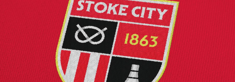
Stoke City have announced that they're finally in a position to change their branding after a long period of consultation with the fans and other invested parties. Due for introduction at the start of the 2026-27 season, it sees a return to the quartered shield that was used between 1977 and 1992. Much like contemporary football kit design, the only way to go forwards, it seems, is to go backwards.
Read more
I know many of you are eagerly following my series, The Kitbliss 100 Greatest Football Shirt Templates, and I truly appreciate your support and positive comments. Understandably, a growing number of you have asked why it's taken so long to reach - [checks notes] - number 33 in the series and when the hell I'm ever likely to get to the end of the project. Let me explain...
Read more

Ten years ago, I was incredibly proud to launch a collaborative project with three good friends of mine. It was the culmination of thirteen months of countless discussions, shared opinions, and a collective vision to present a body of work that we hoped people would value and appreciate.
Read more

The trouble with YouTube is that, like so many other online platforms these days, it seems to know more about you than feels comfortable. That, and the incessant flood of adverts we have to endure in order to make other people richer than Croesus...
Read more

This latest title (O’Toole’s third) specifically focuses on the kits of Serie A throughout the 1980s - a wonderful subject that predates the classic ‘Football Italia’ era remembered fondly by so many...
Read more

If you're a fan of branding and visual design like me, you can do far worse than to visit a website called BrandNew...
Read more

To paraphrase the words of William Shakespeare, I've not come here to bury Kitscene but to praise it. Alas, it may seem the opposite is true.
Read more

There’s a certain irony about the way British football kit design exploded into life back in the mid-1970s. You’d think it would have had tongues wagging across the UK, yet as far as the media were concerned, it was barely worthy of note.
Read more

Hot on the heels of Norwich City comes Costa Rica with a new badge design of their own. Whether there was a more desperate need for theirs is difficult to say. Stylistically, the Central Americans’ former logo looked forever trapped in a world where clipart was king.
Read more

I will admit - it is growing on me. When I first saw the new Norwich City badge around 12 hours ago, my instinctive reaction was to think it was... well, a little juvenile.
Read more

It's staggering how the human species often chooses not to do something simple when the alternative is far more difficult or inappropriate. Whether receiving a vaccine to protect oneself from a deadly virus or electing someone to run a country that isn't a total cretin, Team Human sometimes gets it inexplicably wrong.
Read more

On a sea of football shirts where every tide carries with it colour and creativity, sponsor logos are undoubtedly its flotsam and jetsam. Bobbing around like discarded plastic bottles and empty carrier bags washed away from the nearest beach, they bring clutter to their environment, seemingly of little use to anyone. When, for instance, did you ever think to yourself 'If I ever manage a large company, I really should make sure its finances are managed by Standard Chartered'?
Read more