Fate can cause the unforeseen to happen and random collaborations to take place. This was no more apparent in July 2019 when I received a brief but welcomed message from my good friend, John Devlin. It said: “Hello Chris - Thought this might be of interest. I'm going to give it a go...”
Attached was a link to a web page with the headline ‘Design the official new badge for Watford Football Club... redesign the Watford FC badge and have it become the club’s official logo.’ I was, of course, intrigued and a little excited.
 Watford Football Club, at the time playing in the Premier League, were commonly identified by the distinctive badge they’d adopted in 1978. A red hart’s head on a diamond-shaped background (halved in yellow and black), topped with a narrow rectangle sporting the name ‘Watford’; unique in shape, form and colour where English football was concerned. Why would they want to change something so recognisable?
To be honest, I didn’t dwell for long on such matters. Uppermost at that point was probably the thought of Watford FC adopting a design of my own, distant though that prospect was. For the time being, however, I sent words of encouragement to John and said I’d try and come up with a design too.
A few days later, John and I were chatting again online and the subject of collaboration came about. We’d never really worked together on a design project before, despite both being long-time football kit fanatics. Maybe we should join forces and co-design a new badge for Watford?
We both agreed that this would be a great project to work on and a chance to see how well we’d work together on a design, rather than as individuals working only for ourselves. But what exactly were Watford FC looking for?
In essence, Watford Football Club are known as The Hornets but no hornet featured on their badge. This, it was felt, had to change. Furthermore, according to the design brief, the badge had to have a distinctive shape as “Watford FC like that its current badge isn't a traditional circle or shield.” So far, so understandable.
Other requirements stated that the badge should be “uncomplicated” and, naturally, feature the colours yellow, red and black. Another consideration (applicable for any modern logo) was that it was likely to appear in print, on TV, on the internet and in varying forms of complexity. That said, “fine lines” and “intricate detail” were a no-no.
And that was basically it. Not too demanding a brief, one tended to think. Now for some doodling...
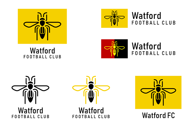
I was the first to come up with a design, and a laboured one at that. Having established what a hornet looked like and what made it distinctive, I set about the task of trying to simplify its appearance into its constituent parts.
 There was a body, head, wings, legs, antennae… all fiddly to draw if you were accurately replicating a photograph of said animal. This, however, was meant to be easy on the eye, so I separated each of the body parts and used thick lines and black colouring accordingly.
The end result was interesting on one level, but clearly lacking cohesion somehow. I was pleased with the fact that I’d incorporated a stylised W into the body and wings, and the shadow didn’t look too bad either, but it was never going to win any competitions.
John seemed to like the simplicity of my designs, but quite rightly suggested we needed a container of some kind to house the main hornet motif. Maybe a circle would work... then again, Brentford FC had recently rebranded in such a fashion, and their badge featured a bee! Avoiding any similarity with that was surely a priority.
John also pointed out that Watford FC were well known as a family-friendly club, so perhaps our hornet design should reflect that? Ironically, there was one factor that stood in our way, namely that a hornet was well known as a potentially unfriendly animal that could sting you. Where to strike the balance?
My first priority was to draw a new version of the hornet itself. Taking inspiration from the recently released and updated logo for the Belgian Football Association as well as the iconic Nottingham Forest badge, I arrived at something with better aesthetics.
A change of font modernised the design further still and with improved versatility, it could easily be rendered in colour or black and white. This was definitely a step up from the previous design, and John seemed to like it too...

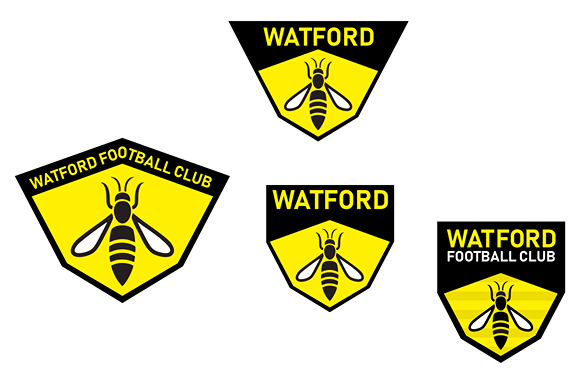
Returning to the idea of using a shield, John took my hornet design and created a container that echoed the shape of its body. Narrowed to a point at its base, this immediately looked right for the job. John showed that the design worked well in several permutations of typeface and colouring, and I thought it was the best version we’d created yet.

Yet John was right to ponder on that hornet motif, though. Somehow it lacked a little ‘sting’, to quote him directly. I knew what he meant. It looked like an insect that had died and been mounted in a miniature glass case by an entomologist.
What to do? With only four days left before the deadline for submissions arrived, we had to work fast to come up with a suitable solution...
Inspired by John’s shield (which at first I thought was too narrow but was now appreciating much more), I tried to refine things further still. Using one of John’s previous ideas, I added a straightened black panel to the top of the shield and changed the font. Another minor step forward, perhaps...

Having seen my suggested changes, John felt we were now getting somewhere. Broadly speaking, the logo was looking much better, barring a few minor tweaks here and there. To that end, John set about changing the legs on the hornet, while also considering that it may not even need to be shown with legs at all. The body of the hornet was tidied up too, shown in solid black or with stripes to echo the background pattern. Even the inclusion of Watford FC’s year of formation at the bottom of the shield was a worthwhile addition.

Of John’s three designs, I was most keen on the third one, and so was John. So, let’s check that design brief... Good use of the club’s colours? Check. Simple, unfussy styling? Check. Hornet present? Check. Distinctive shape? Well perhaps not original, but it was certainly a narrower shield than most teams had. So yes, check.
With time running out, all that was left to do was to create one final spruced-up design and present it in a PDF document for the competition judges...
Before that, a question: Had we overlooked the fact that Watford FC stated in their design that they like their current badge because it “isn't a traditional circle or shield shape”? One could argue that our design did have a relatively traditional shield as part of its make up. Had we made a major faux pas?
John hastily offered an alternative with just hours to go before the competition deadline. This time, he created a hexagonal container for the hornet, presented with the club’s name in a variety of styles. The hexagon shape reflected some of the patches on an Adidas Telstar football or even the cells in a hornet’s nest. Was it a little bit predictable, though? Could the hexagon be made a little more interesting or different somehow?

I decided to do some more doodling. My aim was to take half of the hexagon and extend it in some way so that it ends up becoming a different shape entirely.
Among the designs I created were one that looked vaguely like an air force insignia, one that looked like a hexagon that had been trodden on, and one which looked like a traditional club shield that had been chiselled along its sides. Distinctive, yes, but acceptable? I wasn’t so sure...

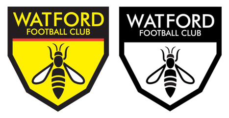
It seemed John wasn’t either, but he did agree that the latter design did have something going for it. Once again, he proved his design credentials by reminding me that red could (and perhaps should) be featured on the badge, and that the underside of the black panel needed to be straightened out. A revision was called for and this one looked quite reasonable.

There was still time for refinements. Perhaps the font could be changed to something more dignified? Maybe the overall height of the badge could be slightly shortened?

A couple of final changes were made. We removed the background stripes and rendered the wings in yellow rather than white, but essentially that was it. We were finally there. The badge design worked on every level - in a technical sense, at least. Nothing more could be added, and nothing taken away.

With only six hours left on the clock, we created our presentation document and submitted it to TalentHouse Art Works, the company acting on behalf of Watford Football Club for the purposes of organising this competition.
Job done!

Much time passed before we heard any news about the badges that had been shortlisted. In November 2019, TalentHouse announced they’d received nearly 4,000 entries and were ready to announce the five that had made it to the short list. Our design, sadly, was not one of them. We were disappointed, but not entirely surprised - especially given the wealth of competition we were up against.
But what of the five designs that were potentially about to be adopted by Watford Football Club? What did we think of them, and were they better in quality to our own?
Well suffice to say we’re not going to single out the individuals that made it to the shortlist at this point. This is no time for us to get personal with our criticism of their creativity. Instead we’ll just say that all of the designs were very well illustrated and great to look at, but managed to miss the brief in one or more ways.
Four of the five designs incorporated a shadow effect to add a subtle three-dimensional element. All well and good, but that adds further colouring to what should be a simple palette, and that in turn can result in extra costs where printing is concerned.
One of the badges was circular (which, one would think, was exactly what Watford FC didn’t want), while a further two simply reused the current badge shape. Hardly a crime, but it hardly smacked of originality either.
Intricate detail - hard to display with clarity - was found on one of the designs, while a couple more looked like the logo for a comic book superhero. Again we return to the earlier matter about Watford FC being a family club, and perhaps this style of logo would work on that level. For me personally, I think it would date very quickly.
But there they were - the five finalists. Whether we liked the designs or not, they’d got further in the competition than ours. Yet ultimately, there would be no winner, no prevailing logo.
It came as something of a surprise when Watford FC assessed the finalists and after putting the decision to a vote, opted to stick with the old badge they had already. Sixty percent of those voting felt it was a step too far to use one of the new designs, which made the whole exercise somewhat redundant.
Many comments were received, several less than complimentary in their tone:
“Well that was a waste of time for everyone involved. They are sticking with old badge. Not only were the brief requirements ignored but they don't want to change after all.”
“"Watford FC like that its current badge isn't a traditional circle or shield shape"... so said the briefing. 3 of the 5 finalists look like this. Another two use the old shield shape...”
“Hi, as a Watford fan, I’m not gutted at not being a finalist but I found this competition poorly organized...”
“Feels like a scam!”
And so it goes on. What a shame, then, that so many people invested so much time and effort into creating something special for Watford, yet were let down in one way or another.
Hopefully other clubs will take note when they open a design competition for their own new badge. As for John and I, we’d greatly enjoyed the opportunity to work together. We felt we understood the brief well and with a mutual respect for each other’s design skills, we enjoyed inspiring one another to craft something that was distinctly ours.
These were our designs, and we hope you like the way they were created.
Graphics reproduced with kind permission from John Devlin.