Ian King of Twohundredpercent.net contacted me shortly before the start of the Euro 2016 finals in France and said: "Since the kits for Euro 2016 are all RUBBISH, wondered if you might fancy designing your own [for Twohundredpercent]?" Of course I accepted the challenge... Whether or not I improved on the real kits for all 24 competing nations remains to be seen.
My comments about the designs which appeared in the final series on Ian's website are shown below, and some of the feedback I received about the kits is also shown for posterity.

Home

Away

Home

Away
Home

Away
Albania: As a kid, Albania always wore red-black-red whenever they played England (which seemed often at the time), and they nearly always had a round necked shirt. A simple design therefore seemed apt, so I've borrowed the kit design Nike used for England a couple of years ago and changed the colour scheme.
Austria: Pretty much a slight updating and tweaking of the Puma kits Austria wore seemingly endlessly throughout the 70's and 80's. I particularly like the stark, clinical nature of the away kit in white and black. One feels that Austria are able to carry off that slightly ostentatious look better than Germany, yet I have no evidence of Austrians being more overtly self-confident than Germans, nor whether their sense of humour could act as cover for a kit like this one.
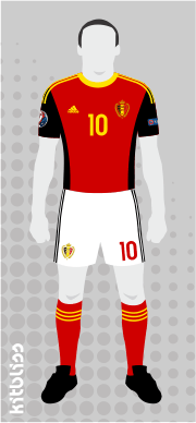
Belgium: Red and black should both feature strongly on Belgium's home shirt (in my opinion), so I've ensured that's the case along with the yellow trim that's also a vital component. As for the away kit, that's predominantly white. Both kits are inspired by the Admiral outfits worn by the Belgians during their purple patch of the early 80's.

Home
Away

Home
Away

Home

Away
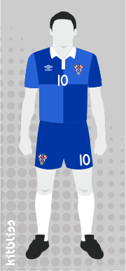
Croatia: This kit may well be my favourite of all those I've designed so far. The perpetual question for proper kit designers must be 'How do you modernise the classic Croatia checkerboard shirt without making a complete Jackson Pollock of it?' My answer is to reduce the red and white checks to a simple 2 x 2 in red and white on an Umbro 'Tailored By' kit. The away kit follows the same approach in a two-tone blue colour scheme. I'd buy it, even if no-one else would.
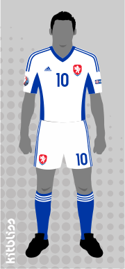
Czech Republic: Before you all complain, I know I've used this Adidas template several times before, but when have you ever known a major football tournament where half the teams weren't wearing different versions of the same Adidas kit? This is therefore a continuation of that reality, rendered smart in the classic Czech red, white and blue.
England: When I think of English football kit design, I think of Admiral: arguably the greatest English kit designers of all. My kit is therefore 'made' by them, but also tries to embody the simplicity of Umbro's 2009 all-white England outfit. There's also a stylistic nod to Umbro's England kit for Euro 88 on the shirt cuffs too. The away kit... well that has to be the classic red-white-red of 1966. What else could it be?

Home

Away

Home

Away

Home

Away
France: Has to be Adidas, even though the last few kits they made for them before Nike's arrival were fairly dire. Adidas are joined at the hip with France, so the three stripes are there along with some simple styling. I've allowed an extra 'Admiral-does-Aberdeen'-style flourish on the away shirt in the form of three vertical stripes running down the right.
Germany: I felt it might be nice to evoke a sense of Germany's past with a 1970's-style black v-neck on the shirt and some 1950's-style hooped socks. Take away some of your traditional Adidas frippery (i.e. their three-stripe motif on the sleeves) and you have a pared down retro vintage kit that is almost worth writing home about. For the away kit, Germany should ALWAYS be in green and white, so that's what they've got. Simple, but assured.
Hungary: Tribute Time once again, this time for the late, great Ferenc Puskas. These kits hark back to the days when a lace-up collar was the height of technological progress and a slight paunch only served to accentuate the ability to drink vast quantities of alcohol. Again, there's another forceful dragging of a classic kit from its distant slumber of years gone by into the modern era in the shape of the away kit. A red, white and green hoop across a (nearly) plain white shirt: surely one of the most iconic designs ever. The original, that is: not the one I've just illustrated.

Home

Away

Home

Away

Home

Away
Iceland: Nothing much to see here. Just a jumble of red, white and blue across both kits, applied to my standard Puma template. Iceland deserve better, but a better designer who was available at short notice couldn't be found, let alone one that MIGHT HAVE BEEN PAID AS A RESULT OF ALL THIS.
Italy: I thought it might be fun to try designing an Adidas kit for Italy, seeing as they haven't previously had one. (Can't be long to go now, eh Adidas?) My home kit features shadow stripes and a white ring neck along with the usual three-stripe shenanigans, whereas the away kit celebrates the simple beauty of the single blue band across the chest that goes back to the 1960's, if not earlier. Ideally I'd do away with all the three-stripe stuff on both kits to present a very basic look but, well, they probably deserve a little recognition as the notional manufacturer.
Northern Ireland: I've gone a bit left field with this one by giving the Northern Irish team a Kappa kit similar to that worn by Italy in 2000. Some understated piping and stitching is pretty much all that's needed to provide a welcome contrast to the current Adidas offerings. I realise Northern Ireland have worn blue on their kits long into the past, but it just doesn't work for me. Green and white is all that's needed, so that's all you get from my design.

Home

Away

Home

Away

Home
Away
Poland: Once again, I have to fall back on my memories of 1970's football by resurrecting a great kit from the past, namely Poland's 1978 round-necked classic. As ever, it's given a modern twist, and the temptation to adorn the kit with unnecessary flashes and devices has been easily avoided. Less is more, and the same applies to the red away kit which is equally evocative of a golden era of Polish football.
Portugal: Having listened to far too many 200% podcasts than is conducive to good health, I happen to know that Dotmund likes to use the work 'rakish' quite a lot. Quite right too: it's a good word and not used anywhere near enough for my liking. Anyway, I hope he'll use it to describe this Portugal home kit, for the shirt has two sleeves in different colours. Not many kits can boast that. These are, of course, the colours of the Portuguese flag, whereas the away kit is in the colours Eusebio often wore when he was on his travels with the rest of his team-mates. Kappa once again, but it seems to fit the brief. Any arguments to the contrary should be sent to Ian King, c/o 200%.
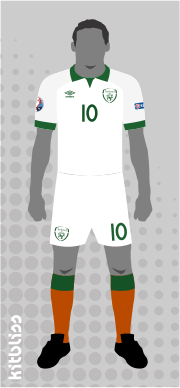
Republic of Ireland: I'm quite pleased with these two. With another nod to the traditional, we have a small 'flappy' collar, no fussy flashes or motifs and (take note, Nike) shoulders and sleeves that are in a different colour to the body of the shirt, but not ridiculously so. The away kit is white with orange socks which will no doubt annoy some people, but they really ought to get out more.

Home

Away
Home
Away

Home

Away
Romania: Again, often an Adidas team in the past, so this shamelessly uses a similar template to the France kits. The home shirt is in the pale yellow they wore during the 1970 World Cup. The blue shorts and red socks complete the ensemble as they always used to until someone (probably Adidas, ironically) decided to go with all-yellow.
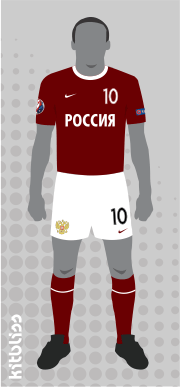
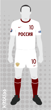
Russia: Like Dotmund, I'm a big fan of those old Soviet Union kits that had CCCP writ large on the front of the shirts. These kits bring that tradition up to date with the word 'Russia' written in Russian because, well, it's Russia. The tone of red used for the home shirt is not the bright version of the old Soviet team, moreover the darker hue worn by the modern-day Russia team.
Slovakia: My Adidas template gets rolled out again for this one, but I think it looks rather fetching in Slovakian blue. Rather than going with Puma's current all-white colour scheme, I think the Slovaks would look better with blue shorts on the home kit. Away from home, I've gone with all-blue and some traditional Adidas trim in white.

Home
Away

Home

Away

Home

Away
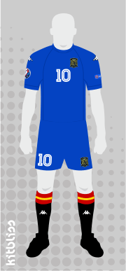
Spain: I figured the Kappa-esque template used for the Northern Ireland kit (see Group C) would work well for Spain. I've therefore replicated it in the greatest and best colour combo ever for the Spanish team, namely red-blue-black. Adidas tried and failed to change the sock colour to blue and then red but neither worked. The socks *have* to be black, and thankfully the German kit manufacturer has seen sense by going back to it.
Sweden: I don't know what it is. Some countries just look better in a round-necked shirt. Sweden is one, and here they have one. For the away kit, I hark back to a lovely equivalent from the late-1970's. Blue shirts and socks, white shorts and a little yellow here and there.
Switzerland: I'll cut to the chase: if you've got a flag with a big white cross on it, why not wear it large and with great pride on your shirt? This is my one allowable moment of design madness, but I think it'll work. I've used Puma as the manufacturer as the manufacturer as it's their current one, but used some of Puma's 'curved panel' styling that was much in evidence on Austria's kits of the 1970's.

Home

Away

Home

Away

Home

Away
Turkey: For me, any Turkey kit that doesn't have a white band across the middle of the shirt with the circular 'crescent and star' badge in the centre isn't worth talking about. This kit therefore makes use of that motif which, for Middlesbrough fans of the late-1970's, must bring a tear to the eye for obvious reasons.
Ukraine: I've given Ukraine my Puma template and it looks clean and crisp, if I do say so myself. Not much else to say except I like the boldness of a kit that's predominantly one colour, and both these kits seem to reinforce that view.
Wales: As with the England kit, I've used Admiral for this Welsh equivalent on account of their classic 'tramlines' kit of the late-1970's. Tempting though it was to do a modern version of that design, I've instead used the same template as that used for my England kit, albeit with a two-tone red shirt and a red-white-green look for the home kit that makes use full use of the colours of the flag. The away kit is in all pale yellow, just as Admiral would have wanted.
© Kitbliss. All rights reserved. | Design by TEMPLATED.