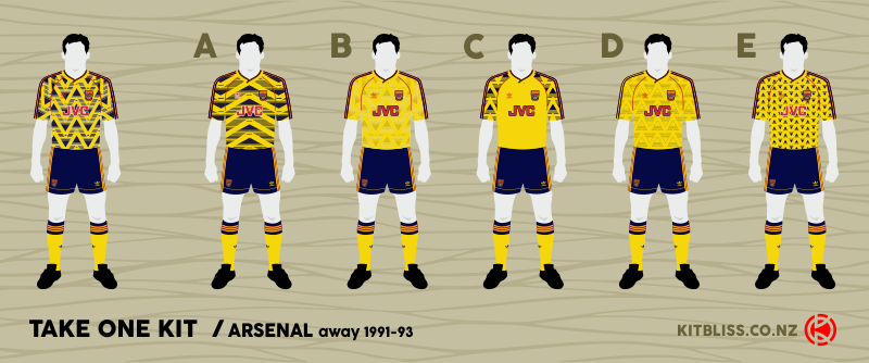
They call it the 'bruised banana' shirt, but to be technical for a moment, when did you ever see a banana that had navy blue colouring? Sorry. Someone had to say it.

A design such as this was never going to be universally liked, in as much as any design can. Arsenal's away kit, worn for two seasons, featured a series of zig-zags running up and down the shirt, each one broken regularly into three parallel 'stripes'. Talk about a sneaky way to reinforce the adidas branding...
Look closer at the shirt, however, and you see each zig-zag as a series of solid triangles, notch removed from their bases, with horizontal lines trailing behind them. Think of a boat gliding through the water, leaving behind an adidas-branded wake... if you must.
It was particularly eye-catching and clinically modern for the late 1980's, but it was all too much for many Gunners fans. Perhaps justifiably, they bemoaned the dilution of yellow on their beloved club's away shirt. Could the design have been better implemented? Perhaps so, and by way of offering up some ideas to that end, here are five options that might have gained greater approval.
'Busy' is a word that certainly comes to mind when looking at Arsenal's original away shirt, no doubt casued by the severity of those pointy peaks and troughs. I therefore wondered whether it might look better with the zig-zags stretched out to slightly flatten their appearance. The end result looks slightly more conventional - nearer to a hooped shirt than the original - but if anything the navy blue colouring looks more dominant than it did before. Given that the insufficient use of yellow was what raised Arsenal fans' hackles on the real shirt, it's fair to say that this one wouldn't passify them very much, but it doesn't look bad as a design in its own right.
So what can you do when a navy blue pattern seems a bit too bold and 'in your face'? Answer: remove it. That's what I did on this design where I've simply taken the original zig-zag motif and turned it into a shadow pattern. The result is a classy looking design that reinstates yellow as the main colour for the away shirt but retains the modern pattern. By way of interest and contrast, I've also kept the red piping across the shoulders and the adidas three-stripe trim, but that's all it needs. Maybe this was the shirt design Gunners fans would have preferred?
Another way of ensuring that the busy pattern of the original shirt was controlled and used in the correct proportions was to confine it to a small area. That's what I've done on this design in which the zig-zags (cleaned up and simplified here) feature only on the raglan sleeves. In this way, you're offered the best of both worlds: a shirt that's mostly yellow, but with sleeves in a contrasting (but crucially not solid) colour. I think it works quite well as the gaps between the triangles allow more yellow to come through, but the pattern catches the eye and looks interesting at the same time.
 Much like Design B, the temptation to remove most of the navy blue was strong, but in this case I've achieved it by rendering the triangular element of the zig-zag pattern in a thin dark blue outline only. If you can't see it clearly on the image above, here it is close-up on the right.
Once again, we don't lose the pattern but the pattern isn't allowed to dominate either. It's a design that hopefully would appeal to the purists, while the kids of the late-80's and early-90's would have something to get an excited tingle about too.
My final throw of the dice swings back in favour of the navy blue which was so strong on the orginal Arsenal shirt. This time, I've taken my pared-down pattern, made it smaller and given it a solid navy blue colour. There's plenty of gaps around those triangles to retain a balance between the blue and yellow, and the overall effect reminds me of a more ordered version of the shirt worn by Norwich City between 1992 and 1994.
So there are my five alternatives, but which one do you like best? Just for fun, I invite you to vote for your favourite design below! It's not a competition - just a way of gauging your thoughts and design sensibilities. Also, if you want to be more detailed in your feedback, please drop me a line via the Kitbliss pages on Twitter or Facebook or via the Contact page on this website. Thank you!