Almost from day one, Heart of Midlothian have worn maroon shirts and white shorts; a constant in an often changing football world. With a respectable willingness to retain their unwavering on-field appearance, Hearts mostly experimented with the colour of their team socks between 1900 and 1970. Sometimes they were maroon, sometimes black and sometimes white, but the former of those seemed to be the traditional preference as our story truly begins at the beginning of the 1970’s.
 At that point in time, Hearts were wavering between three different shirt styles. For the first half of the 1969-70 season, they wore maroon shirts with a white collar and cuffs. At the turn of the year (and for the rest of the season), they switched to a version of the shirt with maroon piping on the collar and cuffs, plus there was a version of the shirt that was completely maroon in colour. Three different options providing what actually appeared to be very little in the way of variation.
Far greater and more eye-catching change was on the horizon when Hearts adopted an Ajaxesque kit in white and maroon for the 1972-73 season, but that proved to be a one-season wonder as maroon returned as the main shirt colour soon afterwards. From 1971 until 1982 (except for 72-73), a triangular inset collar featured on the shirt, and though it may not have been introduced by Umbro, it was certainly maintained by them. It was also a feature when Umbro's diamond taping appeared on the sleeves as the fashion statement du jour of the late 1970's. There were several versions of Umbro's logo taping, the initial version with solid diamonds seen in the 1976-77 season, but the following season (when Hearts adopted it) there followed a version with 'hollow' diamonds that was worn by many teams in the UK, such as Manchester City and Bolton Wanderers.
 The 1980’s was the first decade of considerable change in football kit design, and for Hearts that meant a gradual transition to more understated styling. After the indulgence of Umbro's logo taping, simple collars and piping became the order of the day on the shirt which was, by now, made of a silkier man-made fabric.
Even when Umbro made way for Bukta in 1986, the latter were inclined to carry on with the same stylistic tone - dignity in subtlety and modesty. In fact so subtle was Bukta's continuation of Umbro's approach that it was almost eyebrow-raising when a broken maroon stripe appeared on the shorts during the 1988-89 season. For the previous six seasons the shorts had been plain white, save for the Hearts badge and manufacturer logo.
A series of sponsor logos started making an appearance on the shirt from the 1982-83 season, beginning with Alexander’s and changing to Renault, Mita and Novafone before arriving at Thorn Security in 1989. Before the end of the decade, however, it wasn’t just the sponsor logo that was changing regularly; the kit supplier itself was about to change often too.
 Bukta were well into their five-year partnership when the 1980’s came to an end. Bukta’s early designs for Hearts were not a million miles away from Umbro’s in styling terms, but the 1989-90 season saw a shadow pattern implemented on the maroon shirts for the first time. An alternating half-and-half chevron design ran throughout the fabric and provided some much needed interest to what had been a fairly sterile home kit for many years. Bukta were, at least, showing more imagination on the away kit which by now featured a white shirt with maroon candy stripes in contrast to the plain white or grey shirts of previous seasons.
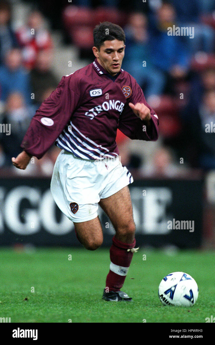
Heart of Midlothian’s kit changed with greater acceleration throughout the 1990’s. Bukta were replaced by Admiral, Asics, Pony and finally Olympic Sports, while the shirt design found new and interesting ways of utilising a shadow pattern. The shorts became longer and the collars altered very little, but that was nothing compared to the shirt sponsor which remained as Strongbow throughout almost the entire decade.
Just before the entire century expired, though, Olympic Sports ramped up the creativity levels by introducing eye-catching elements to the shirt that could not be ignored. The home shirt worn during the 1998-99 season was probably the most challenging for traditionalists, but the new millennium was greeted with a more modest design that was the first to have a one-season lifespan.
 The 2000’s began with Hearts wearing a shirt that now had thin white braces flanked by another set in a shade of dark blue/purple. This colour was also used for a curious circular motif in the middle of the shirt that said ‘Millennium Season - Hearts 2000’. A topical and somewhat indulgent attempt to mark a momentous occasion, and one that didn’t appear to be replicated by other clubs around the UK, for what it's worth.
The dark blue/purple colouring was brought back by Reebok in 2002, but white was seen as the main colour for adding embellishments to Hearts’ home shirt by all of the club's kit suppliers throughout the 2000's.
In the early part of the new millennium, Errea employed a 'modern vintage' approach to designing the Hearts home kit, their first in 2000-01 being an updated version of that which was worn in 1969-70, their next harking back to Umbro's kit from the 1982-83 season. Reebok went for a more contemporary look during their three-year contract before Hummel made liberal use of their chevron motif between 2005 and 2007.
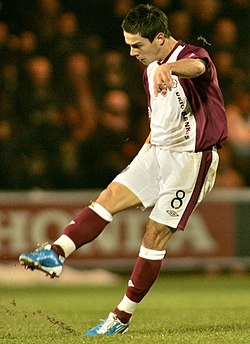
When Umbro returned in 2007 to close out the decade, they brought much imagination to the home kit, but the variety of styles (from all maroon to bold white decoration) may have left some fans feeling that their team no longer had a traditional look on the pitch anymore...
 Umbro's modern look for the 2009-10 season rested heavily on a pair of white shoulder flashes that extended well down the sides of the shirt. White socks were back again too for only the second time since 1988, but Umbro had more surprises up their sleeves for the following season when they modernised a cult classic.
Back in 1972-73, Hearts broke tradition by wearing a white shirt that had a wide maroon band down the middle. For 2010-11, Umbro reversed the colours and added some white shorts and maroon socks. The look was striking, but in reality unlikely to win over enough die-hard fans to be retained in the future. The following season, modern vintage was back with a smart, simple version of Hearts' 1960's kit before Adidas took the reins in 2012.
Their approach was to make the Adidas three-stripe trim the main focus of each of their three home kits, and the last of those was the most noteworthy for bringing back black socks for the first time since 1951. Puma had two seasons to make their mark from 2015 but chose the understated, simple route for their kits, leading finally to yet another stint for Umbro. Much like their kits for Heart of Midlothian in the 1970's and 80s, their 2018-19 shirts use a combination of logo taping (on the shirt cuffs) and a measured use of piping to let the classic maroon colouring take centre stage, as indeed it always should do.