Poor old Bolton Wanderers. It hasn’t been the easiest few months for the club or its fans.
Having expected the Football League’s firing squad to pull the trigger only a few months ago, The Trotters now find themselves alive (if not totally well) in League One once again.
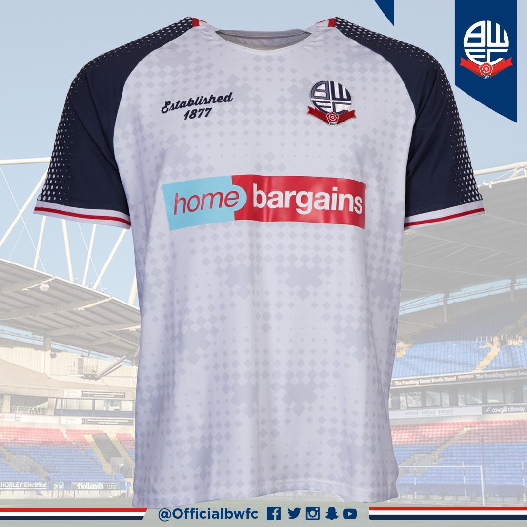
While the transition to a new owner was underway, Bolton had no option but to buy a temporary kit from Hummel to start the 2019-20 season. Now, following completion of the club’s sale to Football Ventures (Whites) Limited, they have a new permanent home kit courtesy of Leeds-based supplier Infinity Apparel. Unfortunately, it’s not a classic.
Most charitably described as ‘a melange of ideas and styles’, it’s more realistically a restrained hotch-potch of motifs that seem curiously inharmonious.
The shirt has a round cutaway neckline with red and white notched trim, the like of which you’ll find on Nike’s Vapor shirts and a million and one others of varying kinds. Then there’s the navy blue raglan sleeves that are decorated in a white halftone pattern that makes the wearer look like they’ve been helping Fred in the Homepride flour-grading factory. The cuffs are finished pleasantly in white and red.
The body of the shirt uses another halftone pattern in pale grey, this time using diamonds rather than dots. The overall pattern consists of overlapping diamond shapes that suggest the designer has been making a lot of Bread and Butter Puddings recently, but hey, everyone needs a hobby.
Elsewhere, the Bolton badge is in its rightful place (made seemingly from textured plastic), but instead of a manufacturer logo we’re presented with some script text saying ‘Established 1877.’ For such a statement to be so prominent on a shirt (proud as the club may be of its history) is a little strange and probably would have been better suited on the back of the shirt behind the neck.
The ‘Home Bargains’ sponsor logo is what it is (i.e. the best corporate branding you’ll find anywhere for two quid) and the Homepride dusting continues onto the sides of the shorts. Sadly, continuity was disregarded with the white trim along the bottom of the shorts which I feel would have looked better with the red striping seen on the shirt cuffs.

The kit is rounded off with white socks that are simply styled with a single navy blue stripe on the turnovers and a slightly-too-big ‘BWFC’ in the same colouring.
All in all, this is an incoherent kit that could have been one of Bolton’s better offerings of recent years were it not for a stronger hand on the design tiller. In real terms, however, none of that’s important. Bolton Wanderers remain a Football League club, and everything I’ve just said is inconsequential by comparison. Forever may that be the case, and let the pursuit of better kits be dealt with some other time.
Shirt image: twitter.com/OfficialBWFC