If this was an audio review of the new Coventry City third kit, it would start with the theme tune to Juliet Bravo. It was the first thing I thought of when I saw the checkerboard running around the middle of the shirt. Go on, say it... I’m puerile, aren’t I?
The correct music to use in such circumstances is, of course, Too Much Too Young or, frankly, anything of a similar ilk because Coventry’s new third kit is a 40th-anniversary tribute to 2 Tone. And it is a magnificent thing that Hummel have created.
As much a part of Coventry as the textile industry and the A4053 ring road, 2 Tone was a musical fusion of styles from reggae to ska and even punk rock. It became identified graphically by its strict black and white colour palette, its checkerboard motif appearing on the record sleeves of bands including The Specials and The Selecter - both proudly from Cov itself.
For anyone that lived through the all too brief period in which 2 Tone sweetened the pop music scene, a tribute of any kind is always welcomed these days. Few, however, would have expected it to come in the form of a football kit, yet it provides a fabulous canvas on which to paint those memories that still bring a smile to our faces.
If it wasn’t for Hummel, this kit may not have existed for many years or possibly even ever. Over the last 20 years or so, Coventry City have had some nice kit designs, but that’s about all you can describe them as. At best, just ‘nice’. None of their home kits have had any real excitement about them, although the same can probably be said of many other football kits these days. Ponder the depressing nature of that statement, if you will.
What Hummel have done, however, is to say 'You want a kit that celebrates 2 Tone music? OK, we can do that.' They essentially took an idea from Sky Blues fan Roger Smith who passed it on to Coventry City's Head of Commercial, Tynan Scope. When the club then spoke to Hummel, they made it happen.
With all due respect, it’s difficult to imagine Nike being so keen to create this sort of bespoke design in recent seasons, nor Puma before them. Perhaps that was a reflection of Coventry City’s diminished status since their relegation from the Premier League in 2001. The old story that ‘Kit Manufacturer X won’t waste their time creating something bespoke for anyone below Premier League level’ may have some truth to it, but it’s at least reassuring to see that some suppliers think differently.
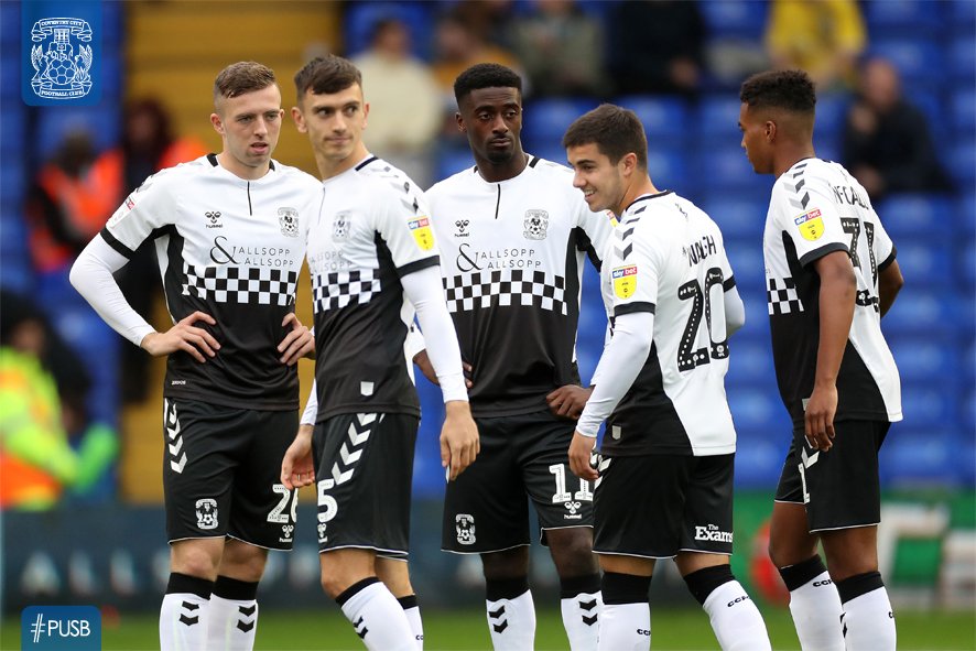
But enough of that. What about this kit, eh? Who would think that this kit design is anything other than just plain brilliant? There are so many aspects to it that are interesting or pleasing to the eye, and for that reason it rises above virtually all other kit designs by default.
The black and white squares around the middle of the shirt are a master stroke. They break up the solid expanses of white and black either side in such a way as to free the shirt from boring conventionality. Other shirts would have created a hard transition between the two colours - a half-and-half division or perhaps some stripes. Even the recent trend for faded designs would have provided a subtle change from white and black, but this is different, strong and confident.
Black side panels and cuffs reinforce the boldness of the shirt design, but black is used to more subtle effect on the neckline and in the Hummel chevrons on the sleeves. And be in no doubt - those chevrons are the unsung hero of the shirt in entirety. Without them, the white upper section would be devoid of interest. Very clever design.
The Hummel chevrons are reversed out in white on the black shorts and the bottom hem is also white for an additional stylish touch. Finally, the socks provide colour balance by being white, although the black turnovers again prevent dullness from thriving on that part of the kit. It also goes without saying that the chevrons look fantastic again, this time in black. I might even go so far as to say Hummel’s motif has never looked so good or worked so hard to make a kit look as good as this. I doubt few would argue.
And there you have it. Probably one of the most innovative kits we’ve seen for a British football club for a long, long time.
My criticisms are few and feeble. To begin, I’d suggest this design would work better as an away kit rather than a third kit, so much would I like to see it worn. The shirt might have also benefited from a more interesting collar too, but at this point I’m clutching at straws so much, I can barely type these words properly.
All I can really do is congratulate Hummel and Coventry City Football Club for being willing partners that committed to making this kit a reality. Other clubs and kit suppliers would have vetoed the whole idea, but as a tribute to 40 years of 2 Tone, that would have been Madness.
Congratulations and well done to all concerned.
Image: twitter.com/coventry_city