
If anyone has ever dared compromise their sanity by listening to me talking on The Kitbliss Podcast, you’ll know that I’m quite partial to a white football kit. White kits have the power to drive out the opposition with a purity of colour and a clean, bold brightness that invigorates with a...
I’m so sorry. I think I’ve just turned into a voiceover for a washing powder commercial. Let me start again.
White kits, when designed correctly, have an uncompromising presence on the field. Real Madrid had it until the 1980’s, Leeds United kits had it during the 1970’s. At the risk of using another washing powder reference, white kits look bold. When kit designers start to tinker, however, that unwavering vision in chalky hues starts to crumble.
Italian kit designers, one might argue, are different... or at least Sampdoria’s kit designers were back in the late 1960’s. Given the job of adding some modern flare to the club's plain white away kit, they chose to decorate the shirt with the classic diagonal sash, but it was the way they did it that really caught the eye.
Using the Sampdoria colour palette, they could have gone with a broad blue sash, or maybe gone with a conjoined blue and black sash in the style that several English clubs embraced in the early 1970’s. In the end they did neither, opting instead for something which - to my knowledge at least - hasn't been attempted by any club since.
They created a six-stripe diagonal sash featuring all of the colours of the two teams that combined to form Sampdoria in 1946; Sampierdarenese and Andrea Doria. The former wore red and black, the latter wore white and blue, and together those four colours (two of them repeated) made arguably the best diagonal sash ever.
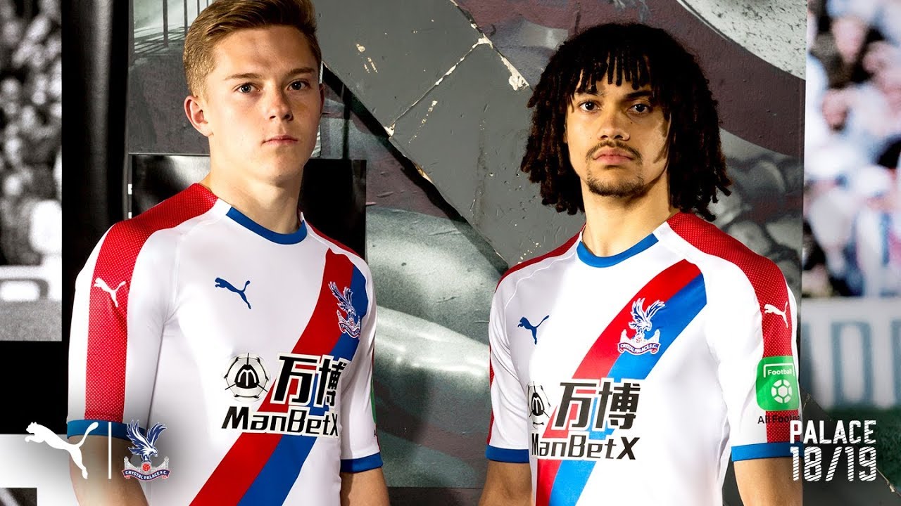
The answer to the question ‘Why don’t we see many diagonal sashes in football anymore?’ might be answered in two words - sponsor logos. There can’t be many examples that haven’t been spoiled by the enforced break-up caused by a corporate emblem, and that’s why the likes of Peru, Crystal Palace and others can boast some classic sash examples from their past. Sampdoria’s 1969-70 away kit can certainly be added to that list, although those diagonal stripes aren’t completely unbroken.
The simple shield featuring the cross of Saint George (from the flag of Genoa) is positioned centrally on the sash, sized not too big as to dominate nor too small as to be insignificant. It features no wording below it and there are no unnecessary ribbons or frippery. It is just a shield, but that’s all the shirt needs. Not even the modern club badge featuring the old sailor Baciccia has a place, but that only works to its advantage.
This is an exercise in what to do when you want to take a pure white football kit and add style to it. Applying colour - especially four colours - is something of a risk, but the width of the diagonal stripes coupled with an abundance of white (provided in part by the long shirt sleeves) is proof that it can be done.
‘Overlooked classic’ is an easy statement to pronounce, but this really is the genuine article.