36. Kappa 'Kombat I' (2000-04) *

Chris Oakley | 29 March 2025
It’s often the case that some of the simplest things in life are actually a lot more complicated than you ever considered. Take the word ‘the,’ for example. It consists of only three letters but can be used in surprisingly complex ways. For example, it's used to specify particular items ("the car") and unique things ("the Eiffel Tower"), but it doesn't work with most country names ("the Germany"). Additionally, it's fine to use it with some abstract concepts ("the morning"), but not others ("the love").
What I’m essentially trying to say is that Kappa’s Kombat template is deceptively simple to look at, but there’s more to it than you might realise. Always start with a laboured metaphor, that’s what I always say.

From left: Auxerre (2002 home, 2002-04 away), Colorado Rapids (2002 home), Feyenoord (2001 away).
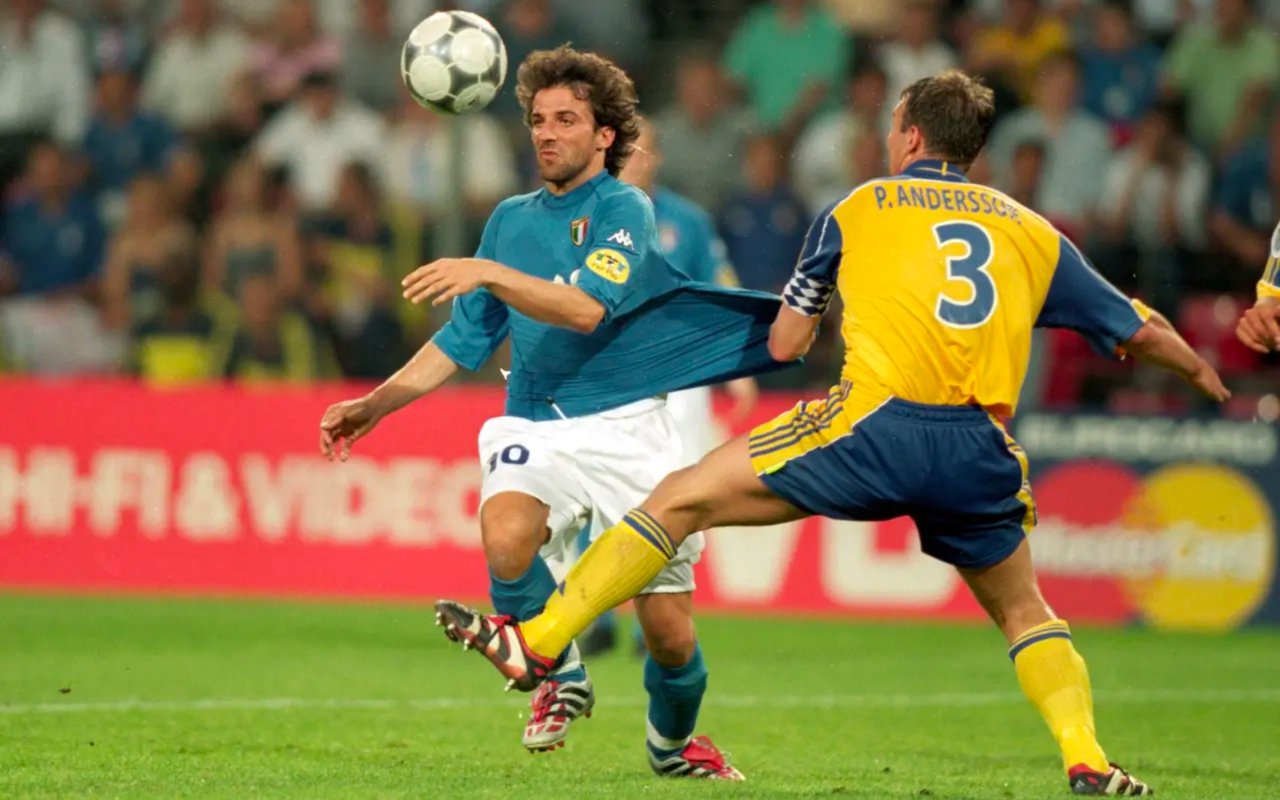
Towards the end of the last millennium, Kappa started developing a specialised material for the Italian national team to wear during Euro 2000. Kombat 2000 was the result of this fusion of technology and sportswear, which provided the likes of Alessandro Del Piero and Fabio Cannavaro with a close-fitting shirt that was still flexible and stretchy. Uniquely, it proved difficult for an opposition player to grab an Italian by the shirt, but if they did, the stretch in the fabric would allow (quite literally) a welcomed degree of wriggle room.
Kombat was the creation of Emanuele Ostini, a man who deserves a statue to stand alongside any number of other religious and mythological figures in Italy. What he helped to produce was not just a fully functional garment for athletes at their peak, but also one that looked effortlessly stylish in a minimal way. Alas, in an era of baggy, loose-fitting shirts, not every football player was keen to wear the end product of Ostini’s brilliance, and many opted deliberately to wear their shirt in a larger size. Their loss, perhaps, as they missed out on the chance to impress all with their lean physique that seemed almost superhuman in comparison with their predecessors of yore.

From left: Genk (2001-02 home), Hapoel Tel Aviv (2003 home), Italy (2000-01 home), Mali (2002 home).
Italy went on to finish runners-up at Euro 2000, and it was here that many people saw the Kombat template for the first time. Aside from the slim fitting, it also boasted decorative stitching that ran parallel to the neckline, across the shoulders and down the shirt’s sides. Rarely, if ever, had connecting threads been used as the main feature of a shirt, but here they were, and coloured in such a way as to draw the eye. Italy’s home shirt was also produced in a softer shade of blue, a simple change that generated much acclaim among football fans around the world.
By now, however, you may have noticed that I’ve unofficially named this template ‘Kombat I,’ and that’s been done with good reason. We may all think we know what a Kombat or Kombat 2000 shirt looks like, but there were numerous versions made, and each boasted differing and varied elements.

From left: Roma (2000-01 home, 2001 third), Shonan Bellmare (2001 home), Tampa Bay Mutiny (2001 home).
The original version (‘version I’) had the basic round neckline mentioned earlier with stitching running up to the hem and parallel to it. Around the same time, another version had additional stitching, while a different version had a three-part sculpted neckline. By 2004, the design was evolving in many subtle ways, but I’ve chosen to focus on the original version here as it employs the distinct elements first worn by Italy in 2000. To avoid confusion, I’ve decided to refer to it as ‘Kombat I,’ although conceivably all the versions and variations could loosely be labelled as ‘Kombat’ by those not willing to go into forensic detail.

Comparison between two versions of Kappa Kombat
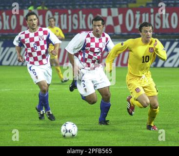
So many teams were tempted by the fine styling offered by Kappa. Wales went all in with four versions; classic red at home, white away, a bold and/or garish yellow-and-sky blue third kit, and a pale yellow fourth kit worn just once against Croatia in 2002. Trabzonspor managed to wear what seems to be the only striped version around the same time, while several teams managed to incorporate some particularly fetching side panels in a secondary colour of their chosen palette.

From left: Trabzonspor (2002-03 home), Wales (2000-02 home, 2002 third), Werder Bremen (2001-02 home).
At this point, you may be forgiven for thinking there’s not much else to discuss, having mentioned the stitching, the fabric and the teams that wore it, but one aspect remains: the Kappa logo. When Italy took to the field during Euro 2000, Kappa decided not to locate its logo on the right breast, as is most common, and instead displayed it on both sleeves. This had two benefits; 1) the body of the shirt looked more traditional in a ‘vintage’ sense, and 2) Kappa ended up with twice the exposure for its branding. It was a final touch of originality and brilliance on the part of the Italian company, even if other teams chose to show off the Kappa logo however and wherever they saw fit.
All in all, it was difficult to spoil this design, and not even those most adorned with sponsor logos managed to achieve it. Fitting very much into the ‘less is more’ category, Kappa created a masterpiece of football shirt design. Often revisited and updated in the years that have followed its launch, it remains one of the most recognisable templates there’s ever been. Perhaps that’s because its styling doesn’t overshadow the identity of the team wearing it. Maybe it manages to retain a sense of traditional integrity, no matter what colour scheme it came in. Or is it simply that every single player that wore it looked fantastic? Even allowing for the prerogative of wearing the next size up, that’s quite an achievement for any football shirt.
My very grateful thanks go to Adam’s Shirt Quest and FSWorld for their help in researching this template.
To see the full set of Kappa 'Kombat I' kits, visit the Kappa 'Kombat I' template gallery page.
See also:
* Unofficial template name