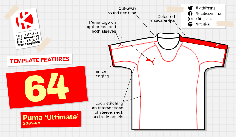
64. Puma 'Ultimate' (2005-08) *

Chris Oakley | 17 December 2022
As we’ve already discovered in this series, Puma got their football shirt designs noticed in the 1980’s and 1990’s by incorporating a flamboyant flourish here or there. It worked like a charm, but creating a constant stream of outlandish apparel was only ever going to make Puma look like a spoiled child desperately trying different ways of getting the attention of its parents. In the world of football, no-one wants the equivalent of a five-year-old throwing a tantrum in a supermarket, and Puma were well aware of that. Once the new century had arrived, it was time to show their creativity in a more dignified way.
And so it was that in 2005, we got our first sight of a set of kits that effectively let the fabric do the talking - or more specifically the stitching. The idea wasn’t entirely original; Kappa had produced a similar set of shirts a few years prior where the panel embroidery was the most prominent feature, and that basic premise was still evolving when Puma had a go at doing the same.

Top row, from left: AEL (2005-06 home and away), Chicago Fire (2005 home and away).
Bottom row, from left: Côte d'Ivoire (2005 home and away), Fulham (2005-06 home and away).
Putting aside their usual insistence on flash and sparkle, they instead made relatively plain-looking shirts that used very visible loop stitching to affix one panel to the next. It was akin to building a car with all the nuts and bolts visible to emphasise exactly how much skill had gone into making it.
Puma differed from Kappa by using additional pieces of fabric to make up the overall garment. Kappa kept things relatively simple with sections for the neckline, sleeves, sides and trunk of the shirt, but Puma wanted more detail. They chose to have a strip of fabric running from neck to cuff, a mid-section on the arm and an under-arm piece that was integrated into the sides of the shirt.

From left: Fulham (2005-06 third), Hamburg (2005-06 home and away).
They also gave greater visibility to the area below the neck with a curved panel that looked vaguely like a baby’s bib. It’s true to say I spent many hours spooning puréed banana and custard into my daughter’s mouth when she was young, and I didn’t fully expect to call upon such experiences when describing football shirts. I guess the metaphor of drooling over your best shirt remains apposite.
But anyway, stitching. Who’d have thought you could make that the central premise of a football shirt design? It’s a magnificent notion and whoever thought of the idea should never have to buy another beer for the rest of their life. As is the case with many things, my illustration doesn’t do the fine detail justice, but it is there if you zoom in far enough. The fact that it’s on the shirt at all is simply brilliant, and it could be said that Puma enhanced its visibility with the use of those carefully crafted panels of fabric.

Top row, from left: Hamburg (2005-06 third), Lazio (2005-06 home), (North) Macedonia (2006-07 home and 2007-08 away).
Bottom row, from left: Metz (2005-06 home and away), Nice (2005-06 home and away).
One of those panels - the one running along the top of the left sleeve - is often where we find another great element of this template: asymmetry. For although not every team subscribed to the principle (I’m looking at you, Fulham), it was fundamentally a chance to add a splash of colour to the shirt, but only on one half. Often that same splash of colour was repeated on the same side of the shorts, and you’d think that would look weird overall, yet somehow it doesn’t. It’s absolutely fine - undoubtedly because the styling seen throughout the kit pleases the eye and masks the imbalance.
The rest of the shirt provides little else to talk about, whether it’s the simple cut-away round neckline or the thin edging on the cuffs, but it’s to no great detriment. The design has already done its job, bringing together interesting characteristics, combined beautifully in a lovely range of colours. Maroon! Sky blue! Yellow! Orange! What a great way to show off a template, and that’s before you come to Nice’s stripes or Reading’s hoops.

From left: Reading (2006-07 home and away), Stoke City (2006-07 home).
So there it is. An example of Puma creating a clever design but this time dialling down the exuberance. A real sign of a kit supplier using every drop of experience to broaden its appeal and increase its high standing in the football shirt design community.

From left: Stuttgart (2005-06 home), Utrecht (2005 home and 2006 away).
* Unofficial template name
