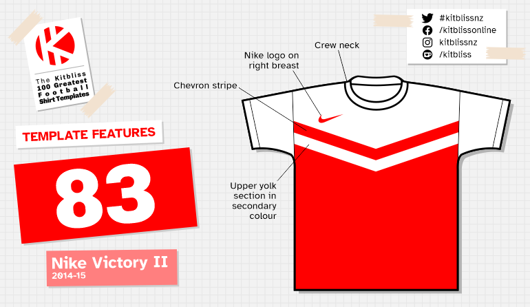
83. Nike Victory II (2014-15)

Chris Oakley | 19 May 2022
Chevrons. They're not as easy to do on a football shirt as you might think. You take on the challenge with confidence and belief in your convictions if you're to do it well. Failure to do so causes ridicule from football fans on social media amid accusations that you were 'trying to be clever' or that 'you don't know what you're doing.' Few kit suppliers try it and only the brave succeed, but in the early 2010's, Nike were damn well trying their best to make the chevron an attainable style trend for any discerning football team.
Without question, it was Admiral who set the bar staggeringly high well over four decades ago. Their home kit design for West Ham United, worn between 1976 and 1980, has become a modern-day classic. Featuring four thin claret chevrons on a sky blue yolk shaped with parallel diagonals, it couldn't have reeked more of the Seventies if it had donned a white jump suit and called itself Elvis. Admiral knew that overstated detail on football shirts was what sold, so that's what West Ham got - an indulgently decorated altar at which to worship the god of great football shirt design.
For the next 30 years, every other manufacturer gave up trying to do anything similar. Thanks to Admiral, the chevron had not only been successfully integrated into a contemporary football shirt, but perfected in excelsis. When Nike ended that period with a renewed intent to update the look, they opted for modernisation rather than betterment.

From left: Aberystwyth Town (2014-15 home), Almeria (2014-15 away), Charlton Athletic (2014-15 home), Darmstadt (2014-15 home).
First, they tried to expand the chevron and add interest through the use of line shading patterns. This created an eye-catching template dripping with 'look at me' affectations. After that, they followed the wider design trend of simplifying things to almost juvenile proportions and rendered the familiar V-shape accordingly. As had been trialled on Manchester United's home shirt of 2009, this looked much easier on the eye, but perhaps a little too basic. Finally, in 2014, Nike tweaked the chevron once again and essentially created the Admiral West Ham style for zoomers.
Their Victory II template brought back the yolk that was worn with such regularity by The Hammers, but instead of being decorated with four chevron stripes, Nike settled for one - suitably wide enough to be seen clearly from a distance. The yolk and sleeves were given a secondary colour (often, but not always white) and the chevron stripe was in the same colour as the lower part of the shirt. No further hindrance was required - even the simple crew neck wasn't allowed to stand out from the yolk.

From left: Dundee United (2014-15 home), Peterborough United (2014-15 home), Southend United (2014-15 home).
It's fair to say that this template had a distinct teamwear look to it, but at least it succeeded in stripping away the elaborations of the Seventies to make it viable for the Twenty-tens. (Seriously - hasn't anyone come up with a better name for the last decade than that yet?) It also appealed to a fair smattering of clubs around Europe who thought it good enough to wear at home or away... or both, in the case of French side Tours FC.
Whatever the two-colour palette chosen, Victory II looked good every time, and it was only Aberystwyth Town of the Welsh Premier League that felt the need to bring in a third colour for the entire kit via the shorts. In fact, it could be argued that the only opportunity for further customisation came with the socks. Most teams went for the plain variety, but Charlton Athletic and Peterborough United went for hoops while Dundee United repeated the chevron theme and inverted it. A rakish look, but one replete with Freudian overtones, given the direction the chevrons were pointing in.

From left: Tours (2014-15 home and away), York City (2014-15 away).
Was this template one of the best of all time? Not if you consider that to be a design in the top 10, but it doesn't need to be to earn a little praise. At a time when chevron designs had been overlooked for so long, Nike worked out how to make it appeal to the young fans of today, and those remembering the kits that were around when they were young. Such a pity Nike never made one for West Ham...
