27. Adidas 'Ensign' (1988-91) *

Chris Oakley | 17 December 2025
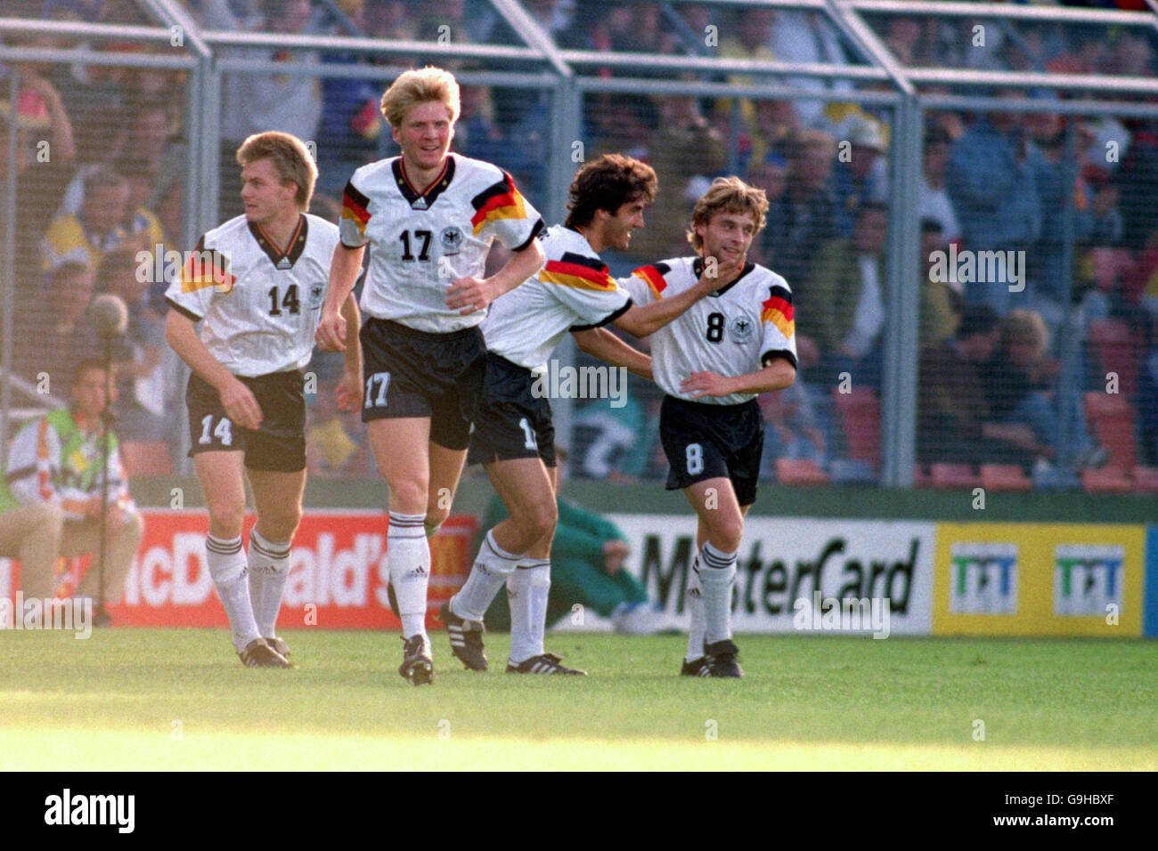
These days, the word “iconic” has become greatly overused. Not only that, but the mere mention of how the word “iconic” has become overused has, itself, become overused. There is, however, one instance where the use of the word is allowed — when discussing West Germany’s home shirt, worn from 1988 to 1991.
As part of the process of discussing our featured template, there is simply no escaping its most well-known form. Seen by millions during the 1988 European Championships (hosted by the West Germans) and later the 1990 World Cup (won by the West Germans), it was unlike any shirt that anyone had seen up to that point. At the time, we thought it was a unique creation, and it probably was. Predictably enough, that didn’t stop other teams wanting to adapt it for their own needs. “Nachahmung ist die aufrichtigste Form der Schmeichelei,” as they say in Berlin.
 Previous versions of the West Germany home shirt had rigidly stuck to a white and black colour palette, only introducing the merest hint of red and yellow in 1986. Confined only to the neckline and cuffs, all three colours of the flag were present, but discreet. Finally, in February 1988, it was all change with the appearance of a tricolore spanning the shirt in thick bands, rising and falling like a graph showing the duration of Black Monday on the world’s stock markets. This new look may have lacked subtlety, but no one seemed to care very much.
This was a template where Adidas and its branding seemed willing to play second fiddle to West Germany’s need for a moment of national pride. The familiar three-stripe sleeve decoration was confined to the shoulder area, truncated by the black, red and yellow bands that not only stretched from arm to arm but also around to the back of the arm. Curiously, the rear view of the shirt was not unlike the front of the Germany home shirt that followed in 1992.
Furthermore, there were no shadow patterns or frippery of any kind. Only a modest wrapover collar and an Adidas trefoil logo were needed to complete what many people viewed as sheer design brilliance. During the 1990 World Cup, the West Germany shirt also acquired a tiny ‘Italia 90’ wordmark, housed in one of the diamond-shaped gaps in the ‘ribbon’, just below the team badge. Unnecessary, in the grand scheme of things, but a nice way to commemorate an ultimately victorious campaign.
No doubt the other aspect that makes West Germany’s home shirt so captivating was its presentation of four colours — uncommon in the world of football then and now. It could only really be achieved by making white the canvas upon which the other colours were painted, and this approach worked similarly well for those shirts worn by Boca Juniors and Cork City. Yet one version challenged the design sensibilities of this template in such a way as to question whether it had gone too far.
 It, too, was worn by West Germany. Appearing only once in a friendly against England in September 1991, a green away shirt was produced by Adidas that added a fifth colour to the palette. Along with supplier logo and team badge in black and the familiar ‘ribbon’ motif in the colours of the German flag, Adidas then highlighted its three-stripe trim in white. Even without this extra touch, the use of green as a complement to black, red and yellow was a little provocative, visually. Colouring the trim white was, perhaps, an attempt to gild the lily that didn’t pay dividends.
On safer ground were Boca and Cork, whose shirts were white, but limited to just two extra colours; the Buenos Aires club borrowed blue and yellow from its home shirt, while their Irish counterparts used the standard green and red for its primary option. In both cases, there was a need to incorporate a main sponsor logo near the middle of the shirt — an area already being encroached upon by the ‘ribbon’. This wasn’t a great issue for Boca Juniors, who, around this time, were sponsored by tyre manufacturers Fate O, and subsequently Fiat. The two companies each had a conveniently short name that was accommodated above and below the ‘ribbon’ respectively.
Things weren’t so easy for Cork City. Their sponsors were Guinness, whose name was too long to squeeze into a small gap. It could only really be displayed across the middle of the shirt, so that meant stretching the ‘ribbon’ to reduce the depth of its coloured bands. Having done so, it was then moved a little higher towards the collar, thus allowing Guinness to have its name shown proudly in familiar territory. Pure genius.
Somewhat unfairly, the shirts of these two clubs are overshadowed by those of West Germany, but it’s difficult to ignore the impact of this single version of the template. It is, after all, still being discussed on websites and podcasts as if it first appeared yesterday, when in reality, it was last worn 34 years ago.
The original West Germany home shirt directly inspired two others for Die Mannschaft, one of which will be worn at the 2026 FIFA World Cup — the last Adidas shirt for Germany in a collection stretching back eight decades. In my opinion, the new design doesn’t quite possess the style and originality of its antecedent, but that’s to miss the point. The fact that this magnificent template is being evoked at the end of a remarkable partnership between Adidas and the German national team shows just how important it really is.
Top illustration: West Germany (1988-91 home and 1991 away). Bottom illustration: Boca Juniors (1990-91 away), Cork City (1989-91 home (version shown: 1990-91 home)).
To see the full set of Adidas Ensign * kits, visit the Adidas Ensign * template gallery page.
See also:
* Unofficial template name