28. Umbro 'Nimbus' (1992-95) *

Chris Oakley | 6 December 2025
Not since the early part of this series has any template been represented by so few shirts based on it. I make no apologies for this. Brilliant design deserves to be rewarded on merit, and this is a clear case in point.
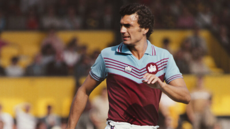
Look up the word ‘premier’ in the dictionary and it’ll give you the definition 'first in importance.' The inaugural season of English football’s Premier League arrived in 1992, and even though it didn’t convince everyone of being first in importance, it did at least showcase one particularly outstanding shirt design.
 When you look at Sky Sports’ launch photo for that first Premier League season, you see a number of great football kits. There are, however, a few — all made by Umbro — that have a distinct ‘vintage’ feel, and of those, the Aston Villa home kit stands above all others.
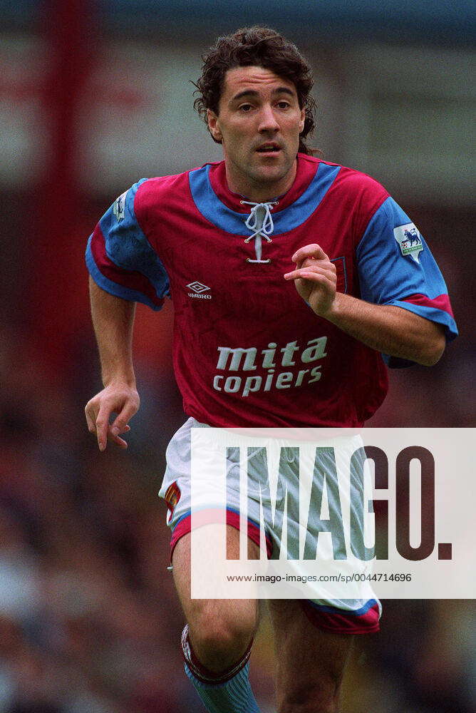
No wonder Tony Daley was smiling so much. He was wearing something revolutionary, something no one had seen prior to that point; a contemporary football kit that lovingly celebrated the styles of the late 19th century. To begin with, the shirt had a lace-up collar. That’s right — actual string that you pulled to close up the neckline. Check it out, kids! It also had a yoke, and the last time anyone had used that word in English football was probably in the late-1970s, albeit for a different interpretation of the form. This was serious football kit design.
Fittingly for Aston Villa, the sleeves of the shirt were in a secondary colour — sky blue, to sit alongside the claret body. Rendering the sleeves in a complementary colour was a constant across all versions of this template, or at least across the handful of examples I found. With the addition of a broad band of trim, mirrored on the hem of their shorts, the overall look simply reeked of old-fashioned sophistication. There may not have been many people around in 1992 that would have seen the kits of 1892 contemporaneously, but Umbro’s committed approach truly made the past come to life.

Shadow pattern details: from left - Aston Villa, Galatasaray, Oldham Athletic, Parma.
Of course, Umbro didn’t simply create a perfect replica of a century-old football shirt. It had to, by necessity, be a product of the modern era, and that meant making it appealing to people living in a world where Microsoft Windows 3.1 was the epitome of mankind’s technical brilliance. To that end, a shadow pattern was woven into the fabric, and a different shadow pattern for every team at that. Individuality and modernity — a lovely thing to have in any shirt.
Such a shame, then, that so few teams adopted the template. I’m not deluded enough to think such an eclectic design would ever dominate world football — it was far too quirky for that — but it offered real character to any team in Umbro’s stable, and there were plenty of those. Imagine Derby County in white and black, or Manchester City in sky blue and white. A world where clubs wear vintage-influenced kits is, in my opinion, not a bad world to inhabit.
 As it is, Aston Villa’s home shirt looked magnificent in a campaign that ended with a second-place finish in the Premier League. Parma, meanwhile, wore their yellow-and-blue away kit in the 1994 European Cup Winners’ Cup final, which they lost 1-0 to Arsenal. A year later, they wore it in the second leg of a UEFA Cup final they won 2-1 on aggregate against Juventus, not to mention throughout their successful 1994–95 Serie A title run. Oldham Athletic’s fetching green-and-blue third shirt was rarely worn, much like Galatasaray’s red-and-yellow third shirt, but both had a vibrancy and class that most kits could only dream of.
Beyond those four teams, I’ve seen pictures of a claret-and-blue Napoli change shirt and another for Hungarian club Videoton that’s almost identical to Parma’s, but I’ve found no evidence that either was worn. That leaves us with memories of an all too small collection of great players wearing one of Umbro’s greatest creations ever. Gianfranco Zola, Dwight Yorke, Faustino Asprilla, Dean Saunders, and many more besides. Fine talent on the pitch, some fine shirts and a very fine template indeed — a combination that happens all too rarely in the world of football kit design.
Top illustration: Aston Villa (1992-93 home) and Galatasaray (1993 third). Bottom illustration: Oldham Athletic (1993 third), Parma (1993-95 away).
Update:
My sincere thanks go to Denis Hurley for confirming that Napoli did wear this template as a third kit. Naturally enough, it was worn in a match against another team wearing sky blue, Lazio, in 1994.
Don't forget, if you've seen any templates in this series and know of their official names (where not stated), please do get in touch and I'll update the appropriate web page accordingly. Thank you!
To see the full set of Umbro Nimbus * kits, visit the Umbro Nimbus * template gallery page.
See also:
* Unofficial template name