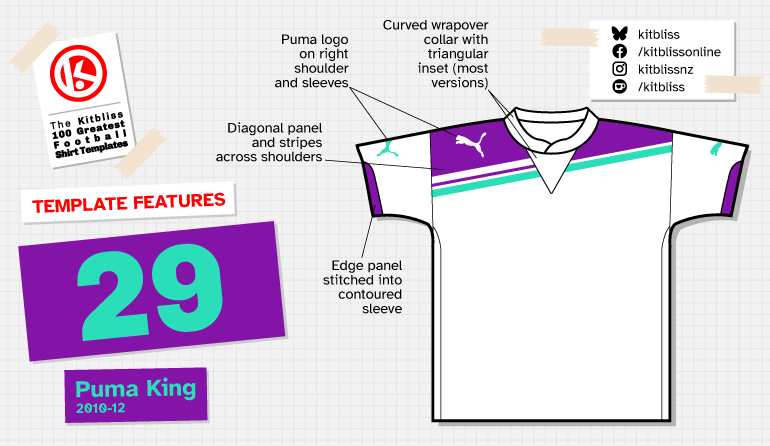
29. Puma King (2010-12)
Chris Oakley | 15 November 2025
In 2011, Puma football shirts started to incorporate a single, simple concept: the diagonal. During the years that followed, their shirts were defined by this feature, appearing as thin or broad stripes, singularly or in pairs, and often placed across one or both shoulders. It all seemed to start with the King template, and such was its multifaceted make-up, it could hardly fail.
Where British football is concerned, the 2010s were a decade that saw Puma providing kit for more clubs than ever before. By the end of the decade, they virtually doubled their roster of teams in England and Wales alone, and they did so by creating confident, stylish designs for each one to wear.
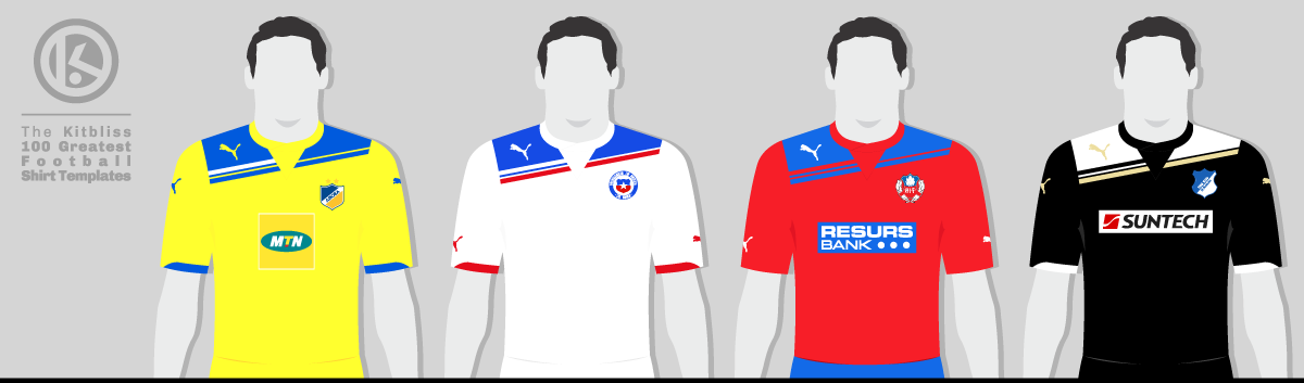
From left: APOEL (2011-12 home), Chile (2011-12 away), Helsingborgs (2011-12 home), Hoffenheim (2011-12 third).
The Puma King template set the ball rolling by introducing detail to the upper part of the shirt that would come to be reinterpreted many times during the next few years. Like a version of Admiral’s England World Cup ‘82 design rotated slightly anti-clockwise, it provided a wide stripe across the shoulders accompanied by thinner parallel tapes below. Puma teamwear catalogues at the time showed six basic options, each one in an attractive three-colour combination.
Rather cleverly, the template could provide a different look for any given team by altering the colours of the main upper stripe, the thinner tapes and the gaps in between. In its most basic form, it provided a highly serviceable two-colour shirt, the most well-known version being that worn by Tottenham Hotspur. With only two colours, however, the focus could be switched to just the tapes (as per the Malmö away shirt), but each tape could have its own colour, as seen on the Helsingborgs away shirt. It was even possible to present all of the elements in a single colour, something that Malmö did in sky blue for its home shirt.
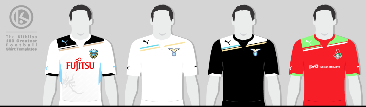
From left: Kawasaki Frontale (2011 away), Lazio (2011-12 away and third), Lokomotiv Moscow (2011 home).
Yet it was the original three-colour format that was seen the most, and in that vein, the white, black and gold (or was it oatmeal?) version seen in the teamwear catalogue was the most popular. But there was also an added factor that made the Puma King template even more fascinating; by including a triangular inset below the neckline, the diagonals were broken up midway across the shirt.
Not only were they broken up, but when looking from left to right, one of the tapes failed to appear after the triangle. It was a clever piece of design that provided an ever-interesting asymmetric ingredient, but also a degree of mystery. Why did all the other stripes run fully across the shirt, but not that one? Is it a subtle message that not everything in life is perfect, or did the template designer simply forget to finish off the stripe? Are we all taking football shirt design too seriously? And furthermore, is anybody still reading this?
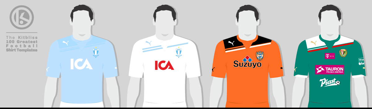
From left: Malmö FF (2011-12 home and 2011 away), Shimizu S-Pulse (2012 home), Śląsk Wrocław (2012 home).
The fact that Puma made a template that has so many hidden depths is a sign of a well—made design in and of itself. But we haven’t finished with the more visible aspects that help make it even better. The curving wrapover collar, the placement of the Puma logo on the upper right shoulder, and in particular the contrasting sleeve inserts on the hem — each one undoubtedly ramps up the appeal. As if that wasn’t enough, many versions of the shirt also seem to have a shadow pattern of prominent diagonal stripes interspersed with thin ones, something that was particularly noticeable on the Kawasaki Frontale away shirt.
If a team was willing to do so, it could extend the diagonal styling of the shirt onto the shorts as well. Many teams did so, displaying those variable-width slants on the left leg. That said, Tottenham Hotspur (home) and Chile (away) managed to acquire specially-designed shorts with the diagonals on the right leg. There seems no apparent advantage to doing this, but it shows Puma’s willingness to cater for any team's exact requirements. It even stretched to providing Brisbane Roar with a unique version of the King shirt and shorts that bore a simplified arrangement of the diagonal stripes.
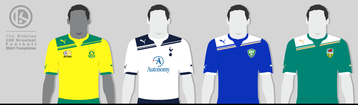
From left: South Africa (2011 home), Tottenham Hotspur (2010-11 home), Uzbekistan (2011 away), Zimbru Chișinău (2012 away).
There was, however, one outlier worth mentioning — the Hibernian 2011-12 home shirt. Though it looks very similar at first glance, it lacks the wrapover collar, triangular inset and sleeve inserts of the other versions. With its simple round neckline failing to break up the diagonal detailing, it doesn’t bear a strong enough resemblance to all the other designs in my view, although it certainly deserves an honorary mention in the context of Puma’s output from the early 2010s.
In hindsight, the King template didn’t just mark a design shift — it announced a new confidence in Puma’s visual language. The German sportswear brand would go on to refine and enhance its liking for an incline in future designs, and unsurprisingly, an increasing number of teams would be only too keen to wear them.
My grateful thanks go to Adam’s Shirt Quest and FSWorld for their help in researching this template.
To see the full set of Puma King kits, visit the Puma King template gallery page.