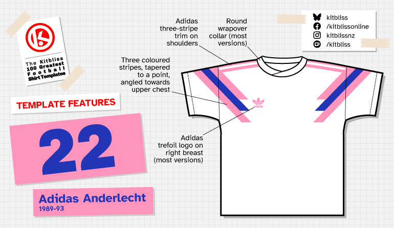
22. Adidas Anderlecht (1989-93)
Chris Oakley | 2 July 2026
The designers at Adidas in the late 1980s clearly believed in giving clients plenty of choice. I suspect they were asked to come up with the next great football shirt design and, rather than selecting the strongest concept, simply decided to put every idea into production.
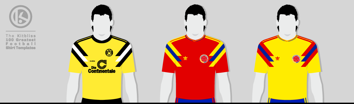
From left: Borussia Dortmund (1989 home), Colombia (1990 home and away).
Now, this won't come as any surprise, but I'm not a professional graphic designer. I wasn't born with the talents required for such a role. Then again, I wasn't born with many talents at all. I've never been able to turn the head of the world's most beautiful women, nor win a fortune on the turn of a roulette wheel. I've never even possessed the sort of keen political brain required to become Prime Minister of the UK, although by the law of averages, I figure it won't be long before my phone rings.
Even I know, however, that when a client asks you to design something — let's say a logo — you don't present just one option. Any designer worth their salt produces several concepts, allowing the client to choose the one they like best. Which is why I can only assume that, somewhere in Adidas HQ several decades ago, somebody looked at an entire wall of potential shirt designs and declared, "Let's use them all."
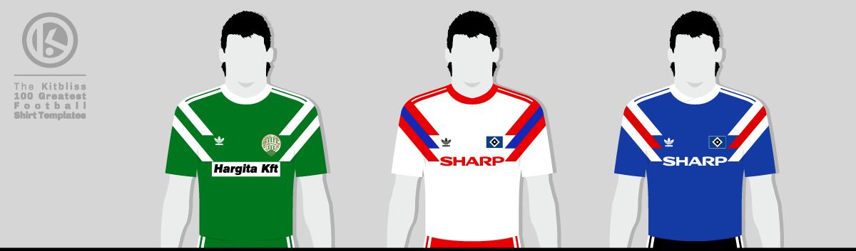
From left: Ferencváros (1990 home), Hamburg SV (1990-92 home and 1990 away).
We've already encountered a couple of examples in this series, and here's another from the same exuberant school of design. The Adidas Anderlecht template was, and remains, one of the company's finest. It employed the same basic idea: using three thick conjoined stripes to imply the overarching brand, and here we see those stripes angled over the shoulder and down to the upper chest, the two outer stripes contrasting with the centre one.
At first glance, I could just as easily be describing the Adidas 'Ascend' template, with its stepped, squared-off stripes. The 'Anderlecht' design, however, sharpened those stripes into chisel points, giving the shirt a distinctly expressive look. Combined with its wrapover collar, it felt more refined than the bolder 'Ascend' template that emerged during the Adidas Equipment era.
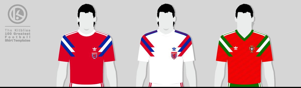
From left: Luxembourg (1991-92 home and 1991 away), Portugal (1991-92 home).
Its debut in a competitive match came in the DFB-Pokal Final of 1989. Borussia Dortmund faced Werder Bremen, and rather than continue with their yellow interpretation of the Netherlands' iconic Euro 88 shirt, they opted for the Adidas 'Anderlecht' template. It was the only time they ever did.
It wouldn't be long before other teams followed suit (or should that be 'shirt'?) During the first round of the 1990 World Cup, Colombia wore their striking first choice ensemble; red shirts with blue and yellow trim, incorporating a more detailed version of the wrapover collar. Having qualified for the knockout stage of the tournament, they were promptly knocked out by Cameroon while wearing an equally appealing away kit that used yellow as the main shirt colour.
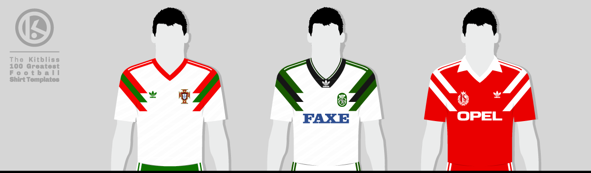
From left: Portugal (1992 away), Sporting CP (1993 away), Standard Liège (1992 home).
Sadly, Colombia were the only team to wear the 'Anderlecht' template in Italia '90, but Portugal, Sweden and Luxembourg would all add their names to the list of prominent wearers in 1991. Of those, Portugal became arguably the most successful when it won the FIFA World Youth Championships that year (essentially the Under-20 World Cup), giving onlookers an early sighting of the great Luis Figo, among others.
Portugal's shirts for that competition were an example of how the Anderlecht template evolved, featuring, as it did, an Adidas shadow pattern. Sweden's shirts from around that time were similarly styled, although truth be told, the shadow pattern was hardly necessary. Elsewhere, however, Standard Liège opted for a winged collar and v-neckline for a more traditional look, while Sporting Lisbon ended the template's run in 1993 with an away shirt that had a broad Adidas Equipment collar.
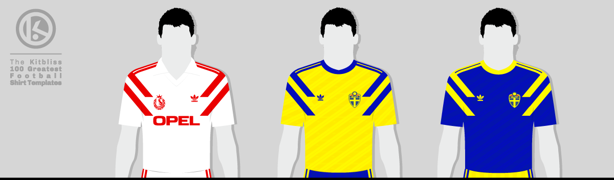
From left: Standard Liège (1992 away), Sweden (1991-92 home and 1992 away).
In retrospect, it felt like a bridge had been built between the old Adidas 'trefoil era' and the 'Equipment era.' A template created in the former eased itself into the latter by borrowing a new-style collar. Once the 1993-94 season was over, Adidas closed the book on the 'Anderlecht' design and, consequently, any trace of the 1980s that lingered on through its work.
Though never among Adidas' most widely used templates, its memory lives on in the fact that it stood out from everything else through its dignified sense of identity. Sufficient reasoning, then, for a 2018 reboot that saw the Colombia team don an updated version of the 'Anderlecht' template — this time in yellow — during their World Cup campaign that year. Same great design, same great execution... and also the same knockout stage elimination, just for complete authenticity. Some classics, it seems, just can't be bettered.
My very grateful thanks go to Adam's Shirt Quest and Football Shirt World UK for their help in researching this template.
To see the full set of Adidas Anderlecht kits, visit the Adidas Anderlecht template gallery page.