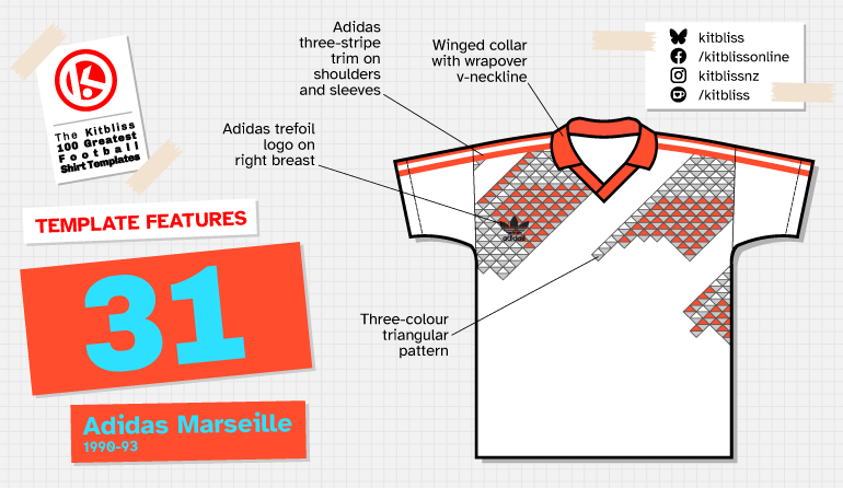
31. Adidas Marseille (1990-93)
Chris Oakley | 18 September 2025
It would be fair to say that many templates in this series have been included due to their superior technical design quality and widespread adoption by many teams. The Adidas Marseille template is another such example... except it fails on the second point. Not many teams wore it, so was it really all that popular, and if not, why not? To understand its limited use, we need to revisit the context in which it first appeared - the World Cup finals.
I’ve often felt that the second day of any World Cup is my favourite - apart from the day of the Final, of course. The opening day is full of anticipation and razzle-dazzle, but Day 2 feels like the true start of the tournament. No ceremonies, no parades of flag-bearing children or dancers in regional dress - just football. On the second day of the 1982 tournament, I remember watching Cameroon for the first time; in 1986, it was Canada making their debut. But in 1990, what really caught my attention was the Soviet Union’s striking white away kit.
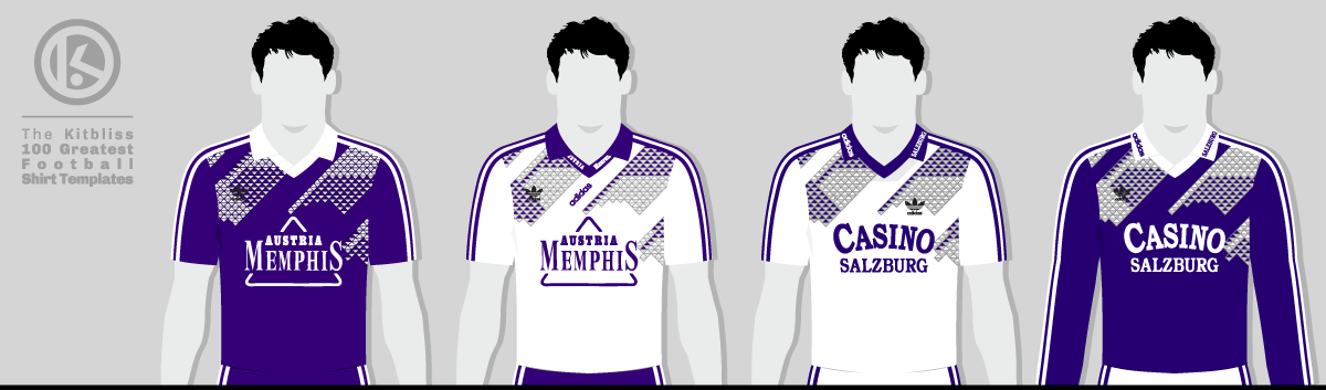
From left: Austria Vienna (1991-92 home, 1992 away), Casino Salzburg (1992 home and away).
I had to wait until the cameras got a decent close-up of one of the USSR players to fully realise what I was seeing on my family’s 27-inch colour TV. Bizarrely, there appeared to be a rash of triangles randomly decorating the upper part of those Soviet shirts. Some of the triangles were white, others red, and others gray, but all were outlined and drifting diagonally in groups that differed in size and shape.
This struck me as being unlike any football shirt I’d seen before. It was undeniably made by Adidas (thanks to those ever-present stripes on the sleeves), but there was something unsettling about those triangles. They were small enough to be barely distinguishable from any great distance, giving the effect of a grey smudge to the untrained eye. Many words could be used to describe the design, but ‘different’ feels the most accurate somehow.
I couldn’t quite decide how much I liked this new Marseille template, and my doubts only deepened the next day when I saw Czechoslovakia wearing it in red, white and blue. It was the same fiddly, abstract pattern of triangles, but in a different set of colours. Even years after the tournament ended, I was still unsure, but after much thought I finally realised that I really did like it, and crucially, why. It was just ‘different.’ There didn’t need to be any other reason, for that was reason enough.
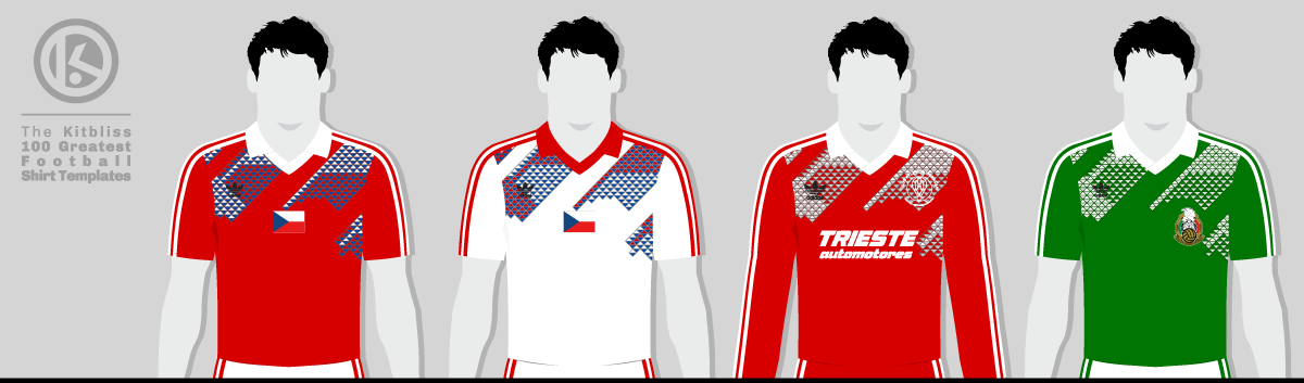
From left: Czechoslovakia (1990-92 home, 1990-91 away), Huracán (1991 away), Mexico (1991 home).
According to a pre-tournament promotional image, there might have been a third team wearing Adidas Marseille at the 1990 World Cup. A version specially made for Cameroon in green, red, and yellow even went on sale around the time of Italia ‘90. Sadly, the conquerors of Argentina in the opening match never got to wear it, depriving us of an undoubted future classic.
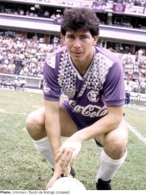
On a technical level, the design of the template wasn’t perfect. For one thing, the Adidas trefoil logo tended to be positioned on the left breast in black, immersed in an expanse of technicolour tessellation. On the other breast, any team badge might find itself similarly obscured, or possibly placed somewhere away from the triangles. Perhaps it was this slight awkwardness that explains why the template was worn by comparatively few teams around the world.
Curiously, Austria was where you’d have found two clubs in the same league wearing Adidas Marseille: Casino Salzburg and Austria Vienna. Both used the winged collar or v-neckline on the shirt to display one or two sponsor logos. Both teams also wore purple and white. Anyone from outside Austria watching the two teams play in 1992 wouldn’t have needed to squint much to forget who was who at various points in the match.
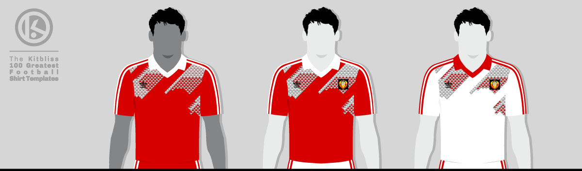
From left: Morocco (1993 home), USSR (1990 home and 1999 away).
But despite the added appeal of seeing those coloured triangles on the shorts of some teams as well as the shirts, its reign was rather brief. By 1993, Morocco were the only team left wearing the Adidas template, long after most other teams had moved on to newer things. Even Reebok’s similar design for Costa Rican club Deportivo Saprissa couldn’t bring about a worldwide trend for shirt patterns based on three-sided shapes.
It’s a shame, really. Football shirt designs like this don’t come along very often, and few are daring enough to be different despite global demand or fan expectations. It’s bravery that counts, though, and someone at Adidas 35 years ago clearly knew what was required to make its product stand out from the crowd.
My grateful thanks go to Adam’s Shirt Quest and FSWorld for their help in researching this template.
Update:
I was grateful to hear about several more kits based on the Adidas Marseille template after publishing the article above. First of all, Peter O'Toole contacted me on Instagram to say that Dynamo Dresden had a rarely worn blue away shirt in 1990, while Yvain Spresni on Facebook mentioned the CSKA Moscow home shirt from 1992. Also on Facebook, Jesper Krogshede Sørensen pointed out Bulgaria's home kit worn only once against Romania in 1991. Great knowledge, everyone!
Don't forget, if you've seen any templates in this series and know of their official names (where not stated), please do get in touch and I'll update the appropriate web page accordingly. Thank you!
To see the full set of Adidas Marseille kits, visit the Adidas Marseille template gallery page.