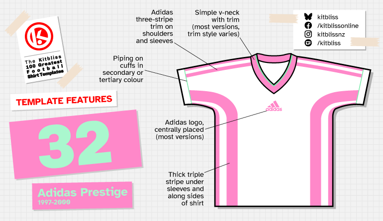
32. Adidas Prestige (1997-2000)
Chris Oakley | 4 September 2025
The FIFA World Cup is rightly revered as the stage upon which the best teams play, featuring the best players who, hopefully, will score the best goals we’ll ever see. Yet it also remains, and always has been, a chance for lovers of football shirt design to gauge which way the sartorial winds were blowing.
Some tournaments feel like a statement being made, where brand new kits with new ideas appear, and the kits of yesterday are relegated to history. That’s how the 1998 World Cup felt to me. Out went the gradient fills and logo taping I’d seen in Euro 96, replaced by simpler, bolder designs that signposted a new way forward. On reflection, things weren’t quite as clear cut as that, but one template from France 98 really did stand out.
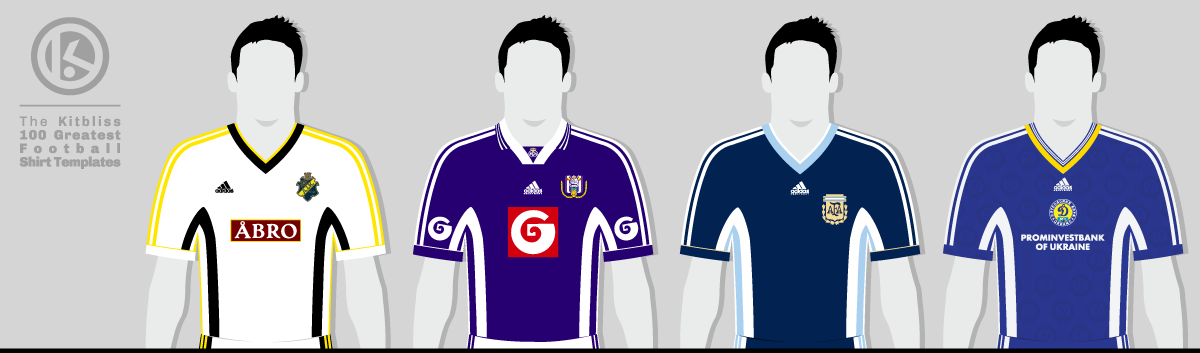
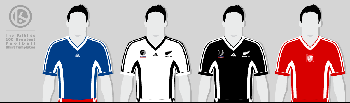
From left: AIK (1998-99 away), Anderlecht (1998-99 away), Argentina (1998 away), Dynamo Kyiv (1998-99 home).
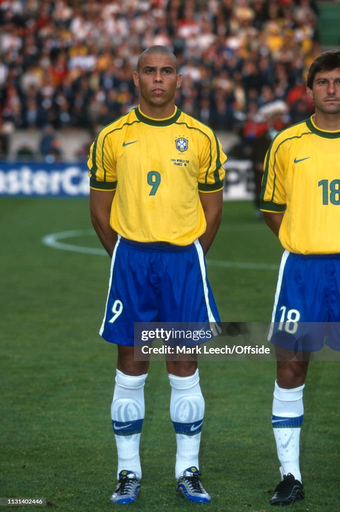
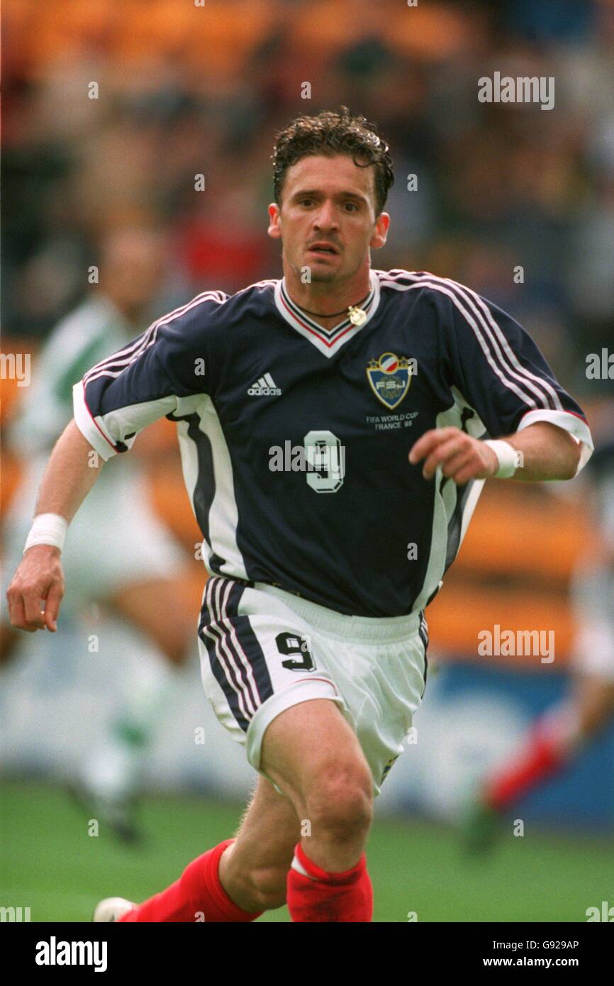
Most people caught their first sight of it on June 14 when Yugoslavia played Iran in their opening game of the 16th World Cup. The Yugoslav team, essentially representing Serbia and Montenegro following the breakup of the former Yugoslavia, took to the field in Adidas shirts that were in a darker shade of blue than we’d seen before, but it was the styling that caught the eye. Running up the sides of the shirt and under the arms were three stripes, and thick stripes at that. This was Adidas branding, but adjusted and obscured to seem a little less obvious.
The width of those stripes was crucially enlarged to an extent that would have dominated the shirt had they not been tucked away to the left and right. From a front view, only two stripes from either set of three were visible - the third was technically on the back of the shirt. Yet for all that, the sides were now decorated with a device that was clean-cut and modern looking. Complemented by a simple V-neck and thin piping on the cuffs, this was how I felt football shirts should look as the year 2000 approached. (Cynics might argue that Nike agreed with that sentiment, once they’d seen Barcelona’s 1999 away shirt.)
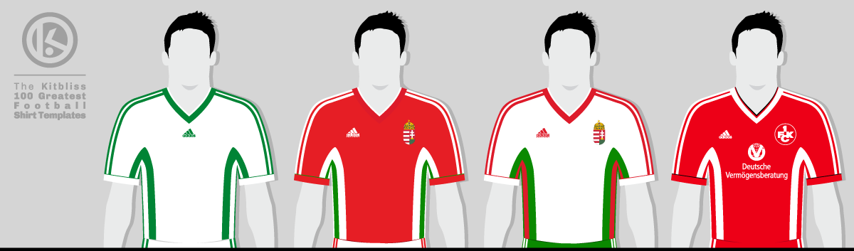
From left: Ferencváros (1998 home), Hungary (1999-2000 home and 2000 away), Kaiserslautern (1998-99 home).
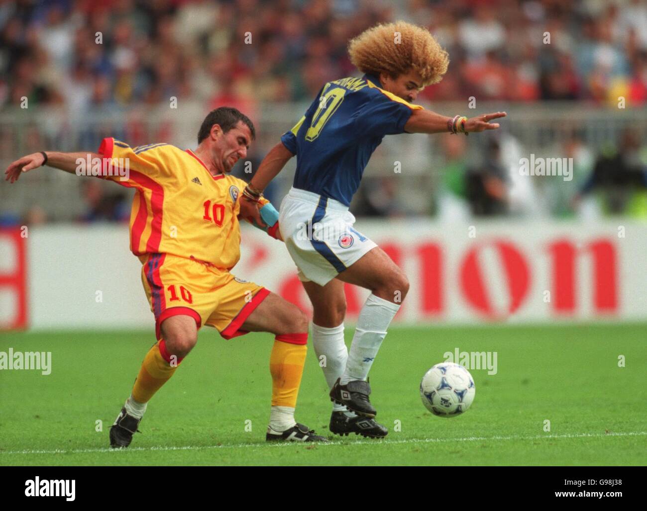
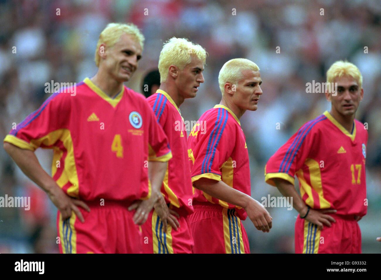
The day after the Yugoslavia match, the world was treated to its first sight of perhaps the most famous version of the template, worn by Romania against Colombia. Awash with warm yellow and featuring red side stripes and a touch of blue here and there, this ensemble showed off the colours of Romania’s tricolore as well as any kit ever has. Even the vibrant red away version was uncompromisingly self-confident in its only World Cup appearance against Tunisia later in the competition.
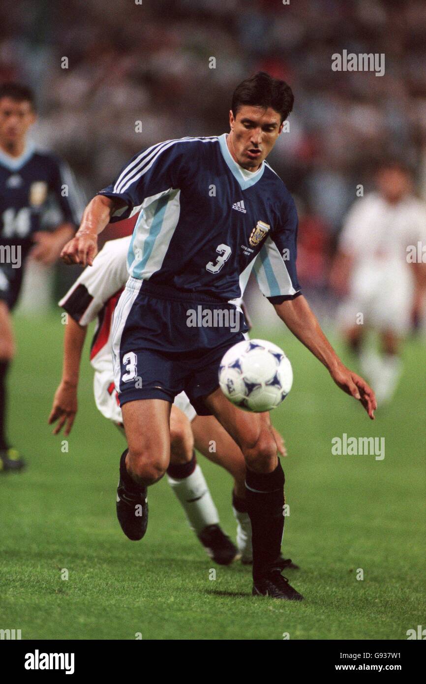
The only other version of the template we got to see around that time was worn as Argentina’s away shirt, and this showed its ability to give greater emphasis to a third colour. While navy blue and white were obviously to the fore, the gaps between those side stripes was the perfect place to use sky blue as a strong accent colour. It worked brilliantly, and Hungary made use of the same technique on their home and away kits in red, white and green around the turn of the millennium.
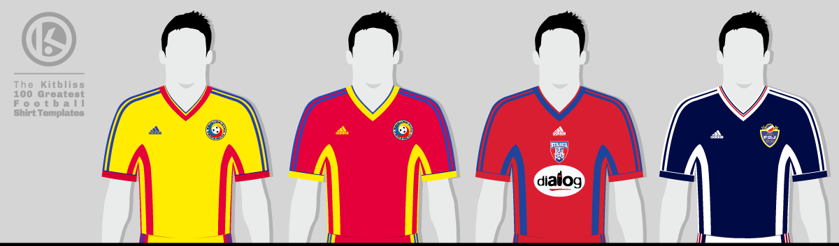
From left: Liechtenstein (1999-2000 home), New Zealand (1999-2000 home and 1999 away), Poland (1999 away).
Even the stripes themselves could be tweaked to the same effect. Swedish club AIK wore an away kit in 1999 that was white with black outer stripes and a central stripe in yellow. Such versatility was admirable, although far too few teams made a virtue of it, in retrospect. Instead, many teams (predominantly across Europe) wore a standard two-colour version that emphasised the greatness of its simplicity. If there was any customisation to be done, it was usually in the trim of the V-neckline which allowed for a multitude of styles.
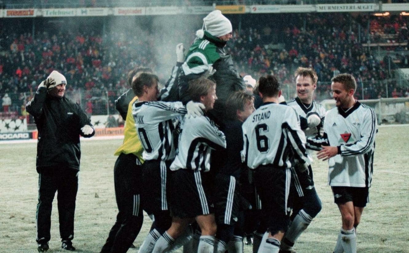
As we so often find out in this series, our featured template was seen in many significant games, even putting the 1998 World Cup to one side. Norwegian side Rosenborg had a memorable 2-0 victory over Real Madrid in the Champions League in 1997, while a Shevchenko-inspired Dynamo Kyiv wore their version on the way to the Champions League semi-finals in 1999. They even knocked out Real Madrid along the way, inflicting a distinctly triple-striped double whammy on the Spanish side.
From left: Romania (1998-99 home and 1998 away), Steaua Bucharest (1998-99 home), Yugoslavia (1998-99 home).
It even appeared in a special FIFA charity match between a Europe XI and a Rest of the World XI to raise money for SOS Children's Villages in December 1997. The former wore white with blue trim, the latter wearing blue with white. An occasion featuring some of the greatest players in the world allows us to reflect on those who got to wear this template; Zinedine Zidane, Ronaldo, Patrick Kluivert, Kanu... why even Derby County’s own Deon Burton shouldn’t be forgotten. Neither should the shirts they wore - all of them dignified, stylish and executed perfectly by Adidas.
My very grateful thanks go to Adam’s Shirt Quest and FSWorld for their help in researching this template.
Update:
Shortly after publishing this article, I heard from Denis Hurley who informed me that the official name of this template was Adidas Prestige. Thanks again for the info, Denis.
To see the full set of Adidas Prestige kits, visit the Adidas Prestige template gallery page.