40. Nike Precision (2011-13)

Chris Oakley | 8 December 2024
There is sometimes a need to stand up for the underdog. It can often feel unfair when deserving causes and individuals are overlooked in favour of those with greater popular support. This explains why we end up with world leaders that are abhorrent, internet influencers who think they’re God, and football clubs that think they’re in a league of their own.
That’s why I’m disposed to offer words of support to anyone and anything that requires them. Take this Nike shirt template which, because I’ve been unable to find the official name, I’m calling ‘Flow’. It’s never going to outrank some of the all-time great templates. It’ll probably never appear in other people’s ‘Top 100’ articles. What it is, however, is a cracking design that combines colour, movement and detail to very good effect.

From left: Alianza Lima (2011 home and third), Almeria (2013 away).
When it comes to chevrons, we’ve walked this way before. The implementation of those ‘V’ shapes can be done in a variety of ways to look discrete, distracting or dominant. In this Nike design from the early 2010’s, chevrons are writ large across the whole shirt (bar the sleeves). There are three descending sections, each one with a greater saturation of the shirt’s secondary colour than the one before, and this is achieved with a form of halftone line shading.
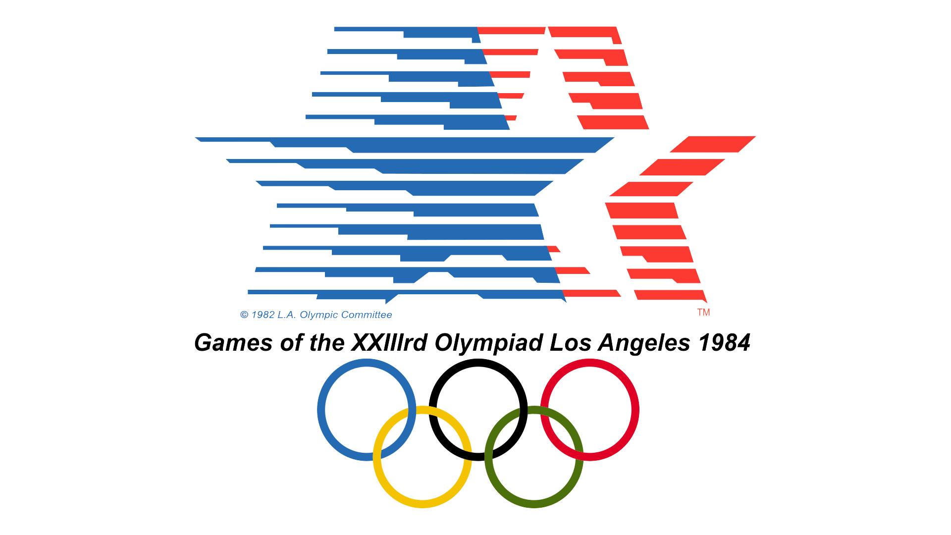
The thickness of the lines that are cut off within each chevron section are what make this an interesting template. Wherever your eye falls across the shirt, it soon finds a vertical that’s been diagonally cut, offset and changed in width. In many ways, it looks rather simple - just lines of different widths, essentially - but it’s executed in a very clever way that evokes the spirit of Robert Miles Runyan’s logo for the 1984 Summer Olympics.

From left: Bradford City (2012-13 away), Ferencváros (2013 home), Girona (2011-12 home).
Such invention and creativity comes at a slight cost, however, in the form of a busy and complicated appearance… and that’s before you decorate it with logos of the kind that modern shirts must have. Once the Nike ‘Swoosh’ is applied and various sponsors have their branding stuck on the chest and sleeves, it does get a little tricky for one’s eyes to pick out one element from another. No matter: as the old idiom dictates, you have to break a few eggs to make an omelette, and this one happens to be pretty tasty.
Tasty, perhaps, but also too spicy for many teams’ palettes as I couldn’t find very many versions worn by anyone of any stature. Of those I did stumble upon, two were in a rather fetching gold and black combination, as featured in the away kits of Almeria and Bradford City. Two were in the more conventional red and white (Girona and Lincoln City), but arguably the most interesting versions were worn by Peruvian club Alianza Lima. In 2012, a century on from adopting navy blue and white for their home kit, they wore Nike ‘Flow’ shirts coloured to suit. Every October, however, Alianza Lima wear a purple change kit as a sign of its devotion to the Lord of Miracles, and this year was no exception. In October 2012, the team from the Peruvian capital wore the same template in a fetching shade of purple, making them the only team to wear it in two different colourways.

From left: Lincoln City (2011-12 home), Trabzonspor (2012-13 home), Wiener Sport-Club (2012 home).
As I often say in this series, it’s a pity more teams didn’t wear this design, if only to allow us to see what it would have looked like in a wider range of colours. Such as it is, only a handful wanted to wear this futuristic take on the humble striped shirt which may have been a little too ‘out there’ for many. For some reason, though, the more people rail against a template like this, the more I’ll stand up for it. Originality is worth its weight in gold where football shirt design is concerned, and it’s my pleasure to provide suitable examples such as this for future evaluation.
To see the full set of Nike Precision kits, visit the Nike Precision template gallery page.
Update:
For the first time in a while, I had to publish an article in this series with an unofficial template name at the top of the page. I simply couldn't find the real name despite a great deal of searching, but thankfully, a couple of people out there in the kit community were able to put that right. For that, I have to extend my huge thanks to Luke on Bluesky and Scott Griffin on Facebook who confirmed that the real name for this shirt template is Nike Precision. I love it when we eventually get the proper name! So there we are - my thanks once again to Luke and Scott...
Aside from the official template name, I also heard from SVBJude on X. He told me about a further four teams that wore Nike Precision - Stockport County, Omonia Nicosia, Erzgebirge Aue and Steaua Bucharest. All were worn during the 2012-13 season, but alas I couldn't find photographic/video evidence of the first two teams wearing theirs in an official match situation. Until I see those, I've drawn the latter two kits, and they've now been added to the appropriate galleries on the website. Thanks SVBJude!
Finally, I've also heard from Jim Hearson on X, who told me about Sparta Prague's delightfully understated version of the template in two-tone maroon. Very nice! My thanks to Jim for that, and don't forget, if you've seen a kit based on this template that hasn't been mentioned, please do drop me a line to let me know...
