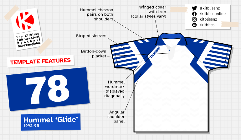
78. Hummel 'Glide' (1992-95)
Chris Oakley | 22 June 2022
Oh Hummel. Don't ever change. Whenever we needed a kit supplier to give us something different or original, you were there. Whether breaking the mould or pulverising it into a billion microscopic particles, the Hummel brand could always be relied upon to bring new ideas to the table. It was often done by loading each design with more detail than other suppliers would dare consider, but sometimes they simply changed the flavour of the visual feast they offered.
Here’s ample proof of the latter approach - further proof that the creative well had yet to run dry. Since the early eighties, Hummel had given the Danish national team a distinctive set of kits whenever a replacement was needed. The home shirt never looked the same twice; it was plain red, then it had white sleeves, was halved in two tones of red and had white stripes across the chest. You never quite knew what you were going to get as a fan of Denmark.
.jpg)
Hummel’s template for the Danes at Euro 92 was extraordinary, particularly in comparison to the safe conventionality of their previous design. Here we find bold stripes on the sleeves adjoined to a zig-zagging shoulder panel, with a modest winged collar, curved button-down placket and Hummel chevrons completing the look. Further adherence to the ballsy design manner could be found on the shorts, but that’s another story. This was Hummel bringing back the white sleeves to the famous red shirts, but specifically on their terms.

From left: Brann (1993-94 home), Denmark (1992-94 home and away).
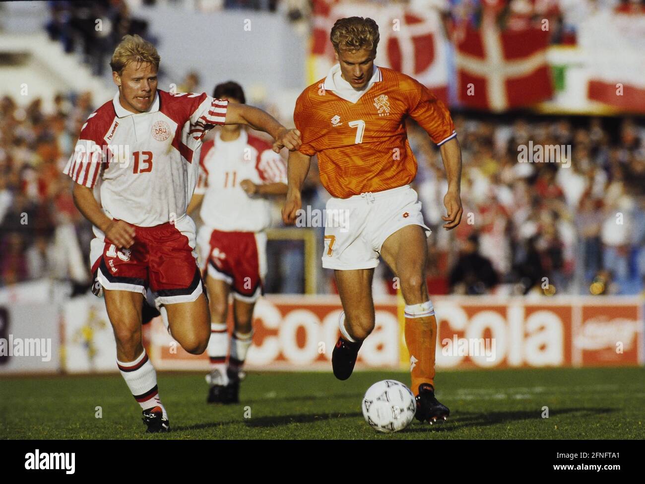
While perhaps lacking the sophistication of the 1986 World Cup home kit, Denmark’s 1992 equivalent still embodied the joy felt by a team that had been given a special golden ticket to take part in the Euros having once before failed. Reversed into white and red for the away kit, the baggy fit of the shirt and the strong lines fitted in well with the ‘deal with it’ mantra of the time.
In the wake of Denmark’s incredible victory at Euro 92, other teams followed suit by wearing the same template. SK Brann, playing in the Norwegian Tippeligaen, went one better by basically taking Denmark’s home shirt ‘as is,’ adding only sponsor logos to differentiate it from the original.
Elsewhere, yellow was a popular colour for the body of the shirt; Brøndby adding blue details to their version, Watford using black with a red placket, and Sunderland using black along with a traditional wrapover v-neckline. Undoubtedly the Sunderland version was a little weaker for the lack of a well-styled collar, but the vivid yellow/black colourway still made the shirt nice and sharp on the pitch. Danish club Viborg wore their issue in green with white sleeves, and Schweinfurt reversed the same colours in Germany, but in both cases a lack of photographic evidence limits my ability to depict them fully in this article.

From left: Brøndby (1993-94 home), Sunderland (1993-94 third), Watford (1993-95 home).
By way of a pleasing final touch, Hummel added their wordmark diagonally to the right shoulder, running parallel to the cut off of the shoulder section. Quite how necessary it was to do that, I’m not quite sure, but I appreciate the intent to do something that other kit suppliers hadn’t.
And that’s very much the point with this design. Though it may not be everyone’s cup of tea, it does at least show some spirit on the part of the designers. Unwilling to pander to the traditionalists, it adds dynamism to the look of any team wearing it. The fact that many didn’t only shows a lack of bravery on their part, but kit design needs courageousness to stop things getting stale. As if that could ever happen with Hummel around.