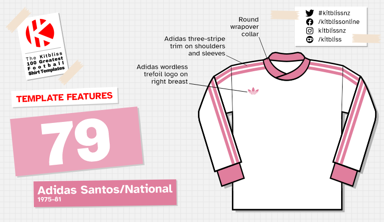
79. Adidas Santos / National (1975-81)

Chris Oakley | 15 June 2022
“And about time too,” I hear you cry. A countdown of the top 100 football shirt templates and only now, at number 79, do I include an Adidas design? Never fear. There will be plenty more of those to come...
As it is, this first Adidas template in our series is pretty much an ideal choice. It takes us back to the point when the German brand’s presence in world football was just starting to grow. The three Adidas stripes that we now know so well were still a relative novelty in the mid-1970s, and certainly a refreshing change from the norm.

From left: Bastia (1976-79 home, 1977-78 away), Belgium (1975-80 home and away).
In the UK, we were entering a world of logo taping on shirts (and many didn’t even have that), but Adidas somehow achieved the same effect with more subtlety and style. The decoration of the sleeves, shorts and socks with those three stripes didn’t require the vulgarity of a repeating company logo. They implied brand awareness with something altogether more abstract, yet perfectly accessible.

From left: Beveren (1978-81 home), Club Brugge (1975-76 away), France (1977-80 home, 1978 away).
And so those stripes found their way onto the first wave of designs Adidas brought out, of which this template was one. By today’s standards, it’s a relatively simple affair consisting of long sleeves and a round, wrapover collar. Back then, however, that’s all any team really wanted - particularly with regards to the latter feature. Winged collars may have been fashionable in the late 1970s, but they had a tendency to slap the face of the players wearing them while they were running. Style over practicality was not what Adidas were trying to achieve here, although flappy collars were embraced again only a few years later.

From left: Lens (1977-78 home), Lierse (1977-78 home and away), Nantes (1976-78 home).
In the UK, the same shirt design tended to be worn by clubs throughout the year; only the length of the sleeve varied to reflect the current temperature. In continental Europe, however, it was not uncommon for the short-sleeved ‘warm weather’ shirts to be based on one design and the long-sleeved ‘cold weather’ shirts to follow a completely different one. It’s enough to confuse your average ill-informed British football fan, and curiously prompted a primitive ‘half-year’ kit cycle in places like France and Germany, the like of which may have caused a Twitter meltdown had it existed in 1977.

From left: Nîmes Olympique (1975-80 home, 1979-80 away and third).
The format for this design is fairly straightforward; main colour of shirt = A, collar, cuffs and trim colour = B. Most of the teams that wore this template followed this simple rule where A was different to B, but some - most notably France and Belgium - incorporated a third colour into the three-stripe trim. Such extravagance nicely draws attention to the fact that those stripes were actually stitched into their own piece of fabric that integrally ran from neck to cuff.

From left: Olympique de Marseille (1977-80 home), Queens Park Rangers (1976-77 home), Red Star (1976-77 home).
Further inspection shows that a couple of teams decided to bend the rules where the collar was concerned. As mentioned before, the collar generally used colour B in contrast to A, but Belgium used colour A for both, be it red on the home shirt or white for the away. Queens Park Rangers, however, went the whole hog and chose a half-and-half system for their collars; white for the left part and blue for the other. This being the early period of QPR’s partnership with Adidas, however, the template wasn’t worn very often. Experimentation with the number of hoops or their inherent widths was common for the London club back then, and sometimes different designs were worn by different players in the same match, let alone season.

From left: Sochaux (1979-80 home and away), Standard Liege (1977-78 home), Strasbourg (1978-79 home).
In general, we didn’t see much of this template in the UK. French league football was where it gained considerable popularity (with Belgium not far behind), and it’s fair to say many other teams around the world wore it too. Were it not for the bout of Covid that hit me a few days ago and an ever-filling schedule, I might have found more examples for you, but you can take it as read that they’re out there somewhere.

From left: Tunisia (1978 home and away), Valenciennes (1977-80 home).
This, then, was the answer to many teams’ prayers: a smart, serviceable shirt design that looked good on the pitch and didn’t stray too far from tradition. Worn in a UEFA Cup Final, the World Cup Finals and in leagues across Europe, Adidas gave the market what it was looking for - simple styling beyond critical analysis. As for the name, some called it ‘Santos,’ others called it ‘National.’ The rest of us just applauded at a job well done.
